Chapter 3 PCA (motivation)
3.1 Summary of the previous chapter
In the previous chapter, we talked about two measures for summarizing our data, variance, and covariance. variance was used to measure the spread of a single variable whereas the covariance was between two variables measuring how much they agree with each other, thus showing the redundancy. We also emphasized that it is nice to have variables showing complementary information rather than overlapping one! We also decided that we want the variance of the signal to be higher than the variance of noise. That is, probably the variables with higher variance are more interesting to us. We also show that the combination of two variables can give us more information about the data pattern, meaning that each of the variables contributes to the overall pattern. So to summarize:
- We agree that we are interested in variance
- We hope that the variance of the signal is higher than the noise
- By combining more variables together, we can probably get more information
- There are redundancies between the different variables but we are mostly interested in the complementary information they provide and to a lesser extent to the redundant information
- We cannot manually handle a huge number of variables at the same time
3.2 variance and covariance
This is a small point but so important that we put it under a separate heading. Please note that variance and covariance are unbiased estimates. This means that they do not take into account the groupings/phenotype/metadata/other information about observations (samples). And we are going to agree that if variable A (a gene) has a variance of 2 and another variable B has a variance 1. We want to remain unbiased and give a higher value to variable A compared to variable B EVEN if B shows us more “true” information about our experiment. So the higher the variance, the better, no matter what it shows. This might sound counterintuitive, but we will show that remaining unbiased, will show us the data pattern that otherwise could not have been found.
- So as of now, we are not going to show you labels of samples until when we want to interpret the data pattern
- Remember: the higher the variance, the better
- variance of the data is how the data is spread, the bigger the spread the larger the variance
3.3 Finding the largest variance
Let’s start working on the same dataset. In the previous chapter, we worked on a maximum of three variables at the time (three axes: variables 1, 2, and 3). Twos variables showed high covariance. Let’s plot them again. This time, without any colors!
# fix number of columns in the plot
par(mfrow=c(1,1))
# define variables
var1<-18924
var3<-18505
# plot the data
plot(data[,c(var1,var3)],xlab = "Variable 1", ylab = "Variable 3")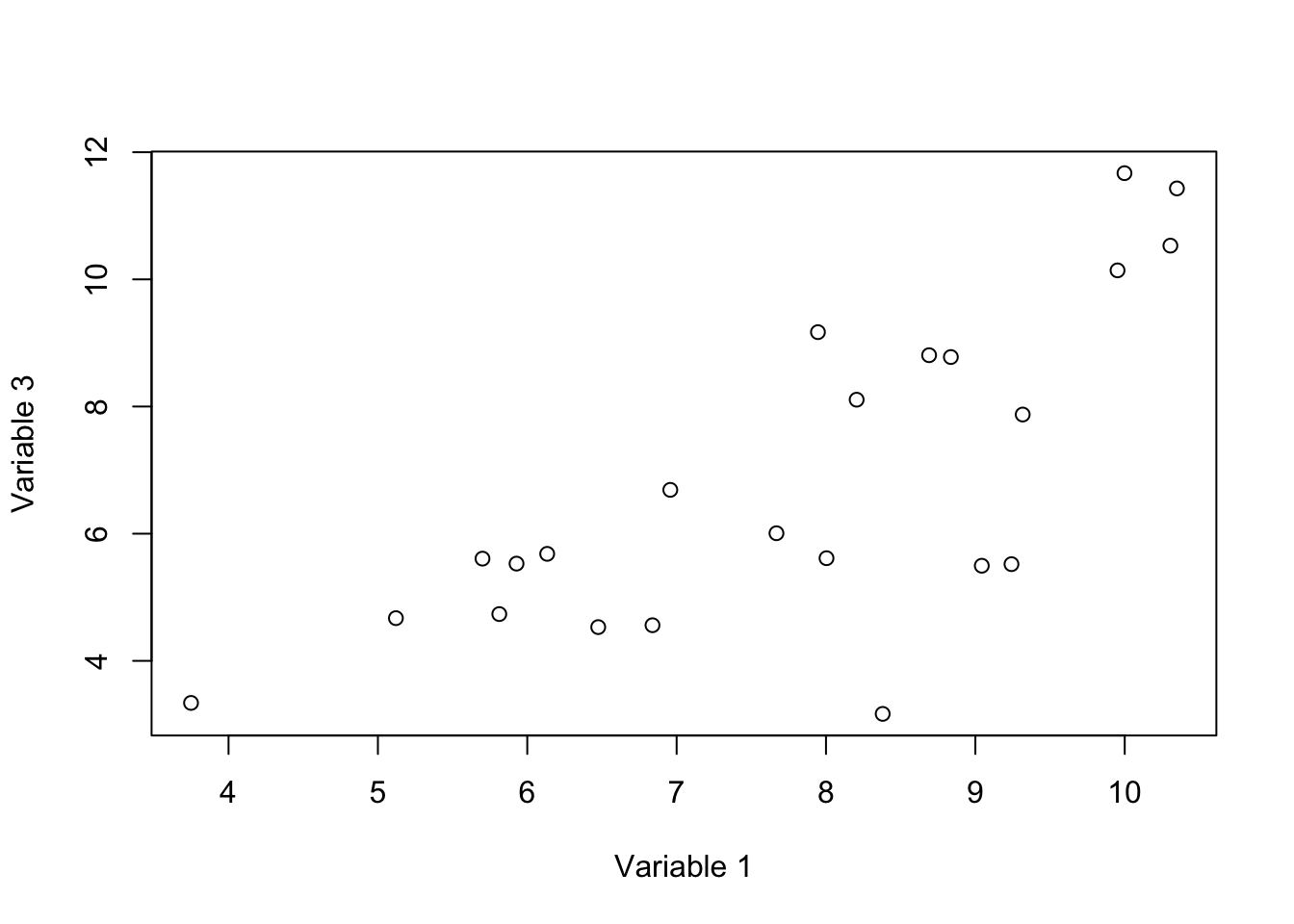
Figure 3.1: Here, we select two variables and show how the data is spread according to the variables.
In this figure, we have two axis, x: variable 1 and y: variable 3. These two variables have high covariance (they change together). Each axis is obviously a line in which each of our observations has a location (or projection). For example for axis x:
# fix number of columns in the plot
par(mfrow=c(1,2))
# define variables
var1<-18924
var3<-18505
# plot the data
plot(data[,c(var1,var3)],xlab = "Variable 1", ylab = "Variable 3",axes = F)
# draw the box
box(col = 'black')
# draw x axis
axis(1, col = 'red',cex=4)
# draw y axis
axis(2)

# plot the arrows
for(i in 1:nrow(data))
{
  arrows(x0 =as.numeric( data[i,var1]),x1 =  data[i,var1],
           y0 = data[i,var3],y1 =2.85,length=0.05,lty="dashed")
}

# plot the data
plot(data[,c(var1)],y=rep(0,nrow(data)),xlab = "Variable 1", ylab = "",axes = F)
# plot the axis
axis(1, col = 'red',cex=4,pos = c(0,0),at =unique(c(floor(data[,c(var1)]),ceiling(data[,c(var1)]))) )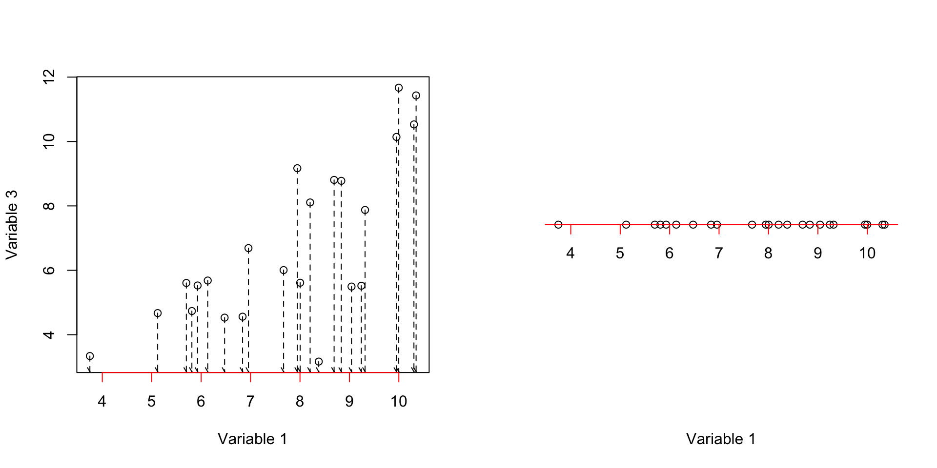
Figure 3.2: Here, we select two variables and show how the data is spread according to the variables. We show how the data is projected on the fist axis
We can see in Figure 3.2 (left panel), all of our observations have been mapped (projected) to the axis x (variable 1). The result is shown in the right plot. Obviously, it gives us the original values of observations in variable 1 with variance of 3.2822776. We could do the same thing for variable 3.
# fix number of columns in the plot
par(mfrow=c(1,2))
# define variables
var1<-18924
var3<-18505
# plot the data
plot(data[,c(var1,var3)],xlab = "Variable 1", ylab = "Variable 3",axes = F)
# draw the box
box(col = 'black')
# draw y axis
axis(2, col = 'red',cex=4)
# draw x axis
axis(1)

for(i in 1:nrow(data))
{
  arrows(x0 =as.numeric( data[i,var1]),x1 =  3.5,
           y0 = data[i,var3],y1 =data[i,var3],length=0.05,lty="dashed")
}

# plot the data
plot(x=rep(0,nrow(data)),y=data[,c(var1)],xlab = "", ylab = "Variable 3",axes = F)
#plot the axis
axis(2, col = 'red',cex=4,pos = c(0,0),at =unique(c(floor(data[,c(var3)]),ceiling(data[,c(var3)]))) )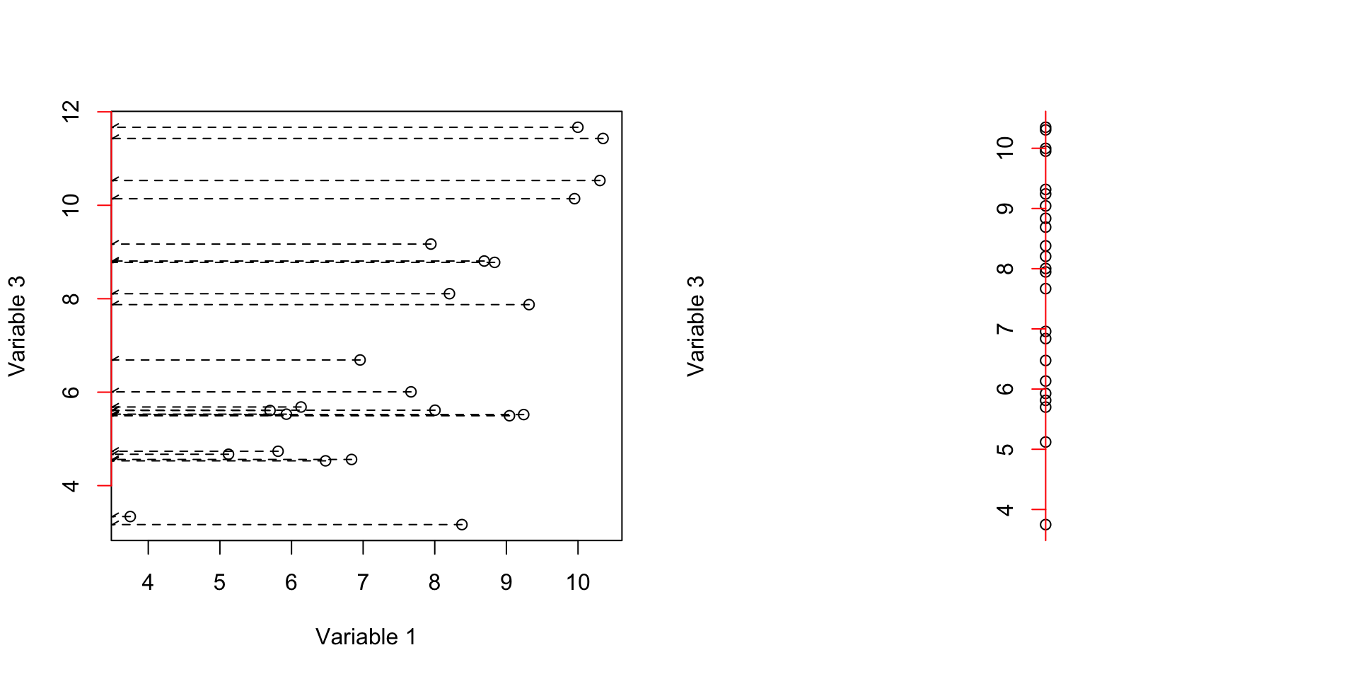
Figure 3.3: Here, we select two variables and show how the data is spread according to the variables. We show how the data is projected on the second axis
This axis in Figure 3.3 gave us variance of 6.3821145. The covariance of these two axis is 3.4341536.
So to summarize, we draw two lines (axis) and mapped (projected the data points to these lines and measured the variance and covariance of the mapped data.
Well, we are not limited to these lines! We can draw other lines. The idea is to come up with a line drawn through the data in a way that the projected data (orthogonal projection) has maximum variance. Let’s try to see what it means in action by randomly draw a line
# fix number of columns in the plot
par(mfrow=c(1,2))
# define variables
var1<-18924
var3<-18505
# plot the data
plot(data[,c(var1,var3)],xlab = "Variable 1", ylab = "Variable 3",xlim = c(2,15),ylim = c(2,15))
# draw a line
# intercept
b<-2.5
# slope
m<-0.5
# draw the line
abline(a = b,b = m,col="red")

#
projected_variables<-matrix(NA,nrow = nrow(data),ncol = 2)
for(i in 1:nrow(data))
{

# calculate the projection
l2 <- c(1, m + b)
l1 <- c(0, b)
l1 <- c(l1, 0)
l2 <- c(l2, 0)
u <- sum((c(data[i,c(var1,var3)],0) - l1)*(l2 - l1)) / sum((l2 - l1)^2)
r<-l1 + u * (l2 - l1)
# end projection

# draw arrow
  arrows(x0 = data[i,var1],x1 = r[1],
           y0 = data[i,var3],y1 =r[2],length=0.05,lty="dashed")


# save the projections
projected_variables[i,1]<-r[1]
projected_variables[i,2]<-r[2]

}


plot(projected_variables,xlab = "Variable 1", ylab = "Variable 3",xlim = c(2,15),ylim = c(2,15))
abline(a = b,b = m,col="red")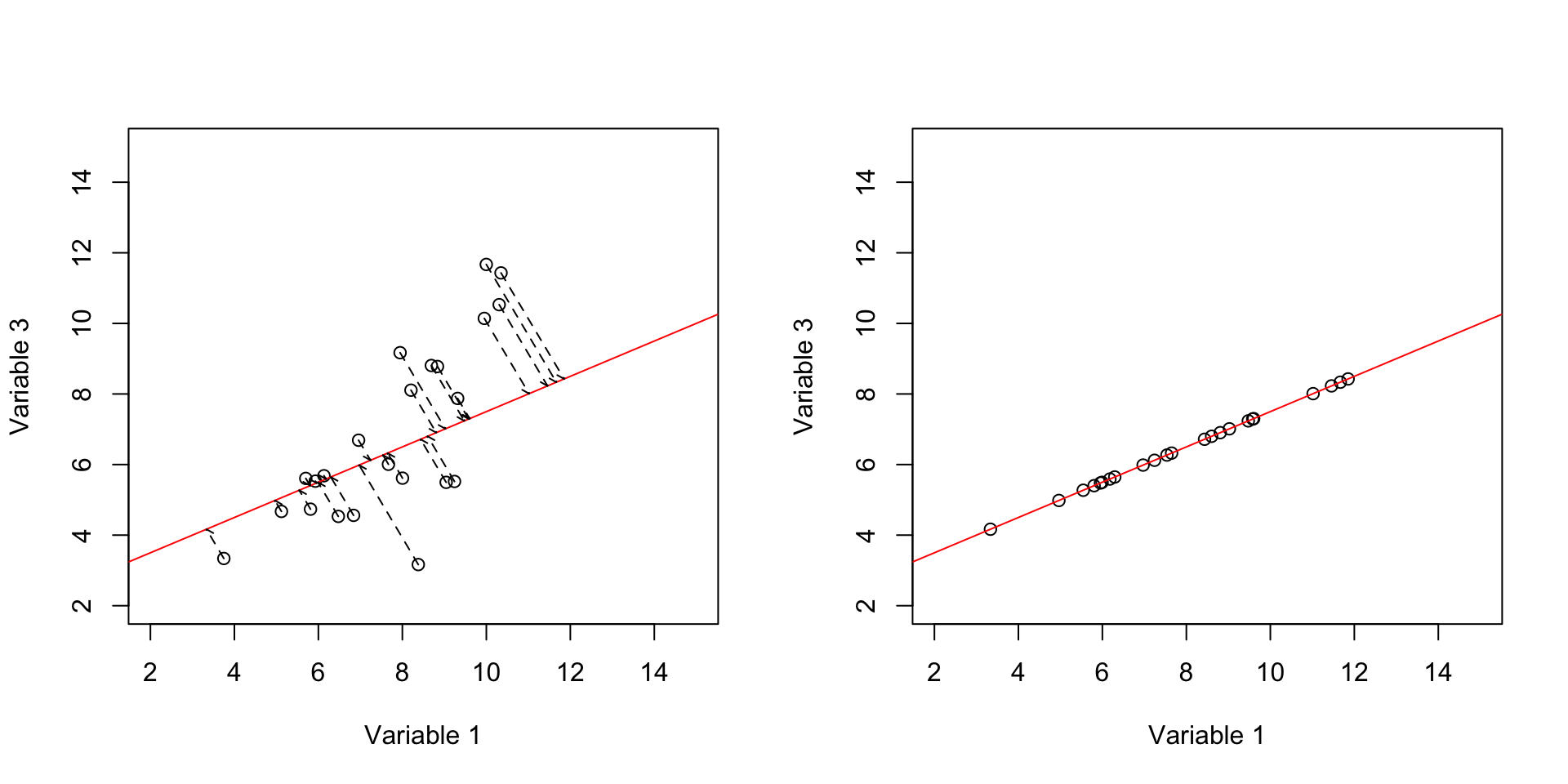
Figure 3.4: Here, we select two variables and show how the data is spread according to the variables. We draw a line through the data and project the data on that line and then measure the variance.
So in Figure 3.4 we have drawn an arbitrary line (left panel) and put everything on that line (right panel). It might be a bit confusing. But let’s rotate that red line so it becomes horizontal exactly like x-axis.
# set number of figures in a plot
par(mfrow=c(1,1))


plot(x=apply(projected_variables,1,mean),y=rep(0,nrow(data)),axes = F,ylab = "",xlab = "Combined variable 1 and 3")
axis(1, col = 'red',cex=4,pos = c(0,0),at =unique(c(floor(apply(projected_variables,1,mean)),ceiling(apply(projected_variables,1,mean)))) )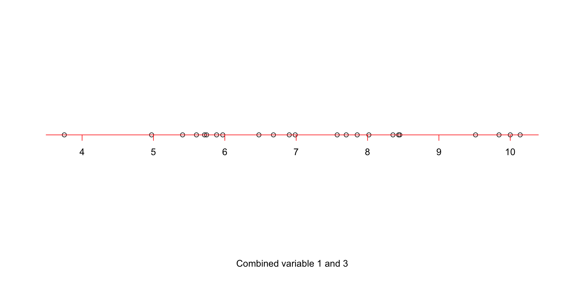
Figure 3.5: Simple rotation of the projected points on the line
Figure 3.5 shows our new x-axis. If fact, this is a new variable! It’s not quite variable 1, it’s not variable 3, but a combination of these two. What is the variance of this new variable?! The variance is: 2.9923055. Well, that is great! But the question is, we can draw as many lines as we want, what should we do? Let’s, imagine that we can try infinite possibilities. Which line would you select?
# fix number of columns in the plot
par(mfrow=c(1,3))
# define variables
var1<-18924
var3<-18505
# plot the data
plot(data[,c(var1,var3)],xlab = "Variable 1", ylab = "Variable 3",xlim = c(2,15),ylim = c(2,15))
# draw a line
# intercept
b<-2.5
# slope
m<-0.5

# draw many lines using different slope and intercept
for(b in c(1:5))
{
  for(m in seq(0,1,by=0.1))
  {
    abline(a = b,b = m,col="red")
  }
}

# intercept
b<--5.172751
# slope
m<-1.548455
# draw the line
abline(a = b,b = m,col="blue",lwd = 2)


plot(data[,c(var1,var3)],xlab = "Variable 1", ylab = "Variable 3",xlim = c(2,15),ylim = c(2,15))

# draw the line
abline(a = b,b = m,col="blue")


#
projected_variables<-matrix(NA,nrow = nrow(data),ncol = 2)
for(i in 1:nrow(data))
{

# calculate the projection
l2 <- c(1, m + b)
l1 <- c(0, b)
l1 <- c(l1, 0)
l2 <- c(l2, 0)
u <- sum((c(data[i,c(var1,var3)],0) - l1)*(l2 - l1)) / sum((l2 - l1)^2)
r<-l1 + u * (l2 - l1)
# end projection

# draw arrow
  arrows(x0 = data[i,var1],x1 = r[1],
           y0 = data[i,var3],y1 =r[2],length=0.05,lty="dashed")


# save the projections
projected_variables[i,1]<-r[1]
projected_variables[i,2]<-r[2]

}

# save projection direction (came from svd)
projection_directions<-matrix(c(-0.5425087359 ,-0.8400501601,-0.8400501601,0.5425087359),nrow = 2)


# decenter data
decenter_data<-scale((scale(data[,c(var1,var3)],scale = F))%*%projection_directions, scale = FALSE, center = -1 * c(7.767432,6.854765))


# plot the data
plot(x=decenter_data[,1],y=rep(0,nrow(data)),axes = F,ylab = "",xlab = "Combined variable 1 and 3")


axis(1, col = 'blue',cex=4,pos = c(0,0),at =unique(c(floor(decenter_data[,1]),ceiling(decenter_data[,1]))) )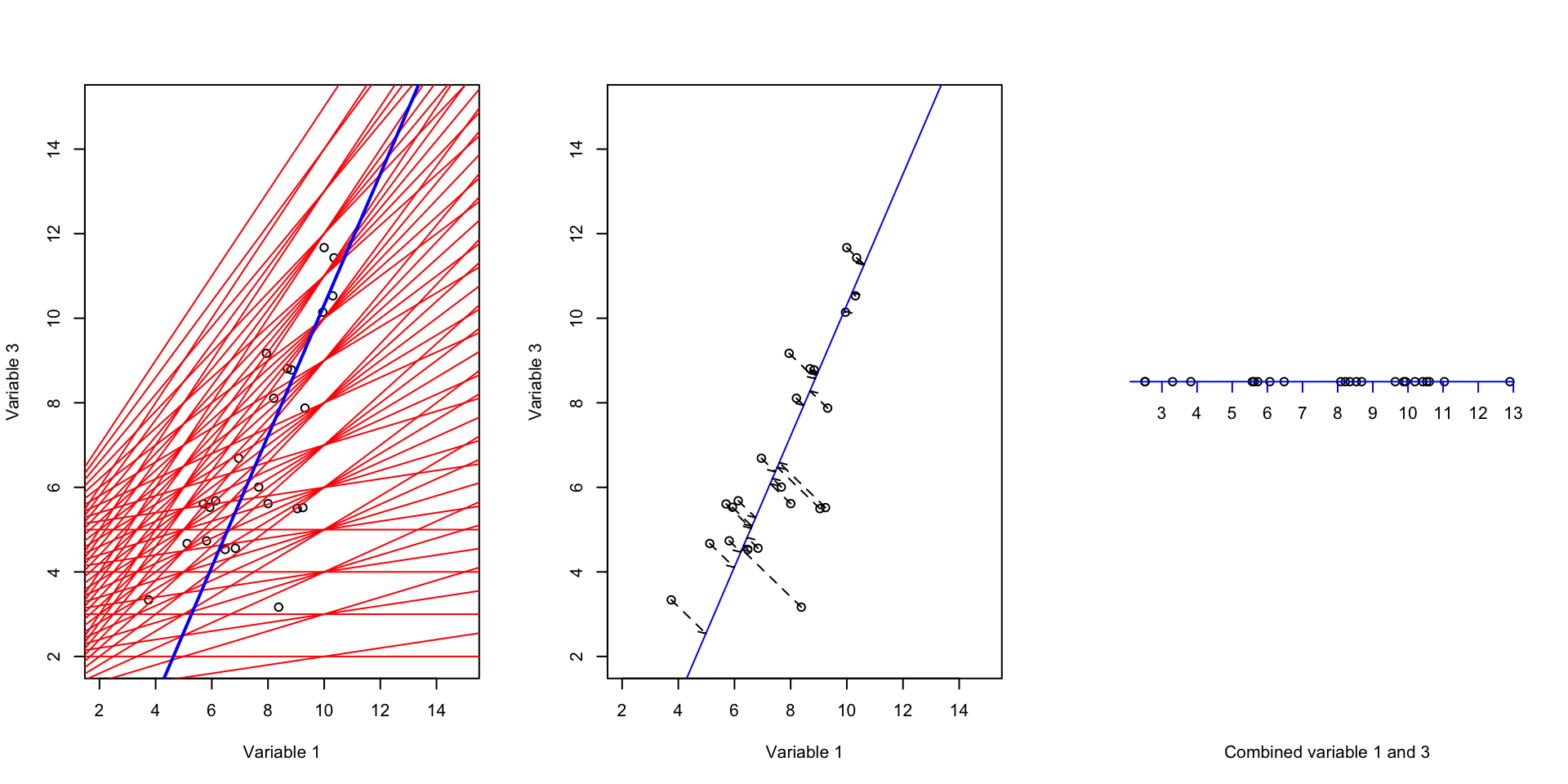
Figure 3.6: We try to fit many lines through the data but there is only one of the lines that capture most of the variance
Intuitively, one would select a line that has the maximum variance. That is the blue line. variance of this line is 8.5999087 that is the highest amount all other lines that can be drawn. By now, we have a new variable that is a combination of the original two variables and has captured most of the variance. But how about the remaining variance? What should we do about the redundancy?
So ideally what we want to do is to come up with another line that when we mapped the data on it, it captures the remaining variance but also avoid redundancy. The last point means that the covariance between the observations that we have already mapped to the first line (the blue line in Figure 3.6) and the observations that we mapped on this new line should be zero or very close to zero.
It turns out that the only way of finding such a line is to find the line that is orthogonal to the first line (the blue line in Figure 3.6). Orthogonal means that the angle of this new line to the blue on should be exactly 90 degrees:
# set number of plots to 1
par(mfrow=c(1,1))
# plot an empty plot
plot(1,type="n",axes=F,xlim=c(-0.1,1.2),ylim=c(-0.1,1.2),xlab="",ylab="")

# define axis
x1 = c(1,0)
x2 = c(0,1)

# plot x arrow
arrows(0,0,x1[1],x1[2])


# plot y arrow
arrows(0,0,x2[1],x2[2])

# draw angle
segments(x0 = 0.1,y0 = 0,x1 = 0.1,y1 = 0.1)
segments(x0 = 0,y0 = 0.1,x1 = 0.1,y1 = 0.1)

# draw arrow to the text
arrows(0,0,0.17,0.17)

# write text
text(0.4,0.2,"This angle is 90 degree",cex=1.5)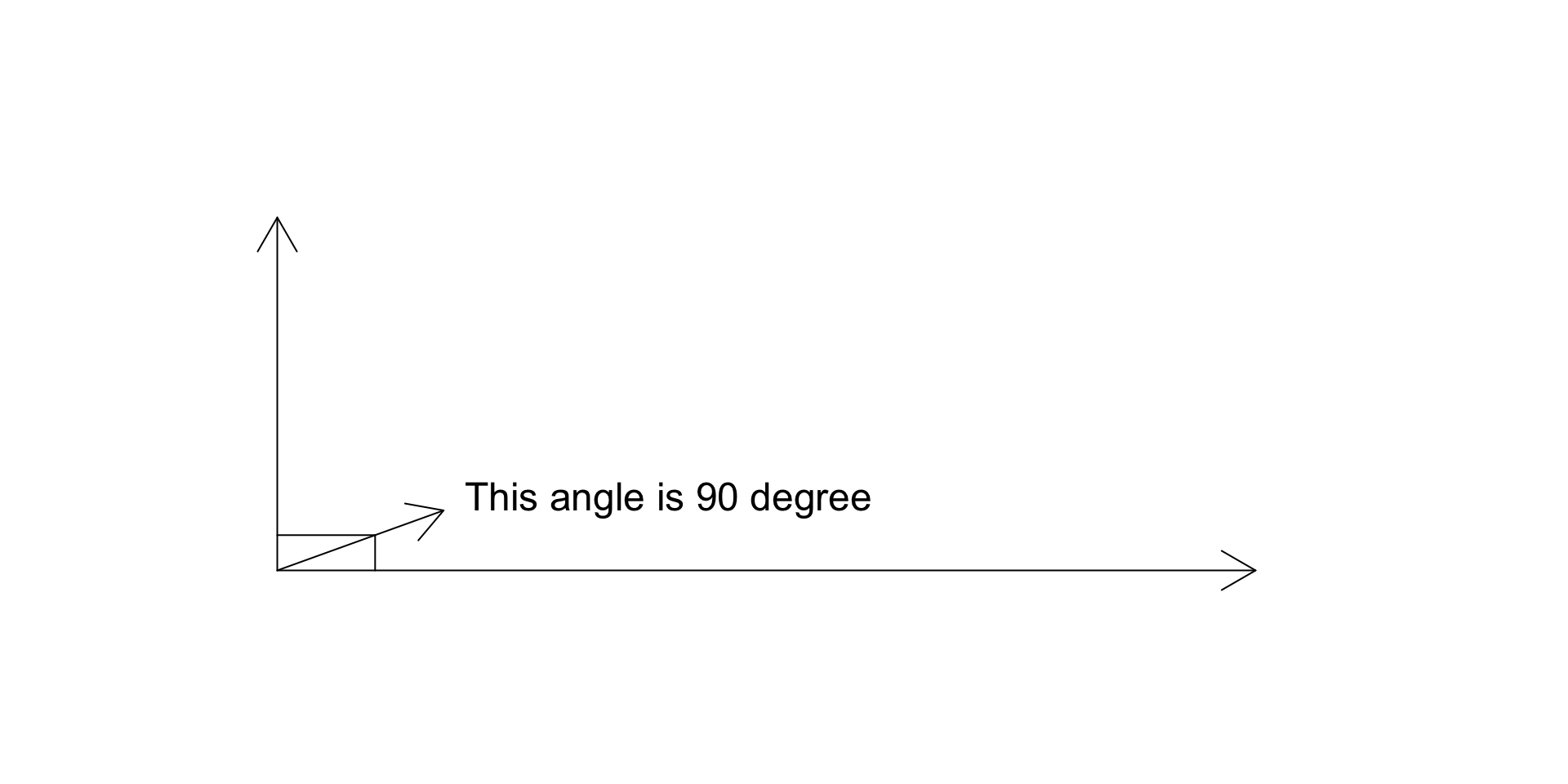
Figure 3.7: We try to fit many lines through the data
Figure 3.7 shows two arbitrary lines, the lines are called orthogonal/perpendicular to each other.
So now that we know what orthogonal means, we will find a line to be orthogonal to our blue line in Figure 3.6):
# fix number of columns in the plot
par(mfrow=c(1,2))
# define variables
var1<-18924
var3<-18505
# plot the data
plot(data[,c(var1,var3)],xlab = "Variable 1", ylab = "Variable 3",xlim = c(2,15),ylim = c(2,15))
# draw a line

# intercept
b<--5.172751
# slope
m<-1.548455
# draw the line
abline(a = b,b = m,col="blue",lwd = 2)

# intercept
b<-11.8710127
# slope
m<--0.6458052
# draw the line
abline(a = b,b = m,col="green",lwd = 2)


#
projected_variables<-matrix(NA,nrow = nrow(data),ncol = 2)
for(i in 1:nrow(data))
{

# calculate the projection
l2 <- c(1, m + b)
l1 <- c(0, b)
l1 <- c(l1, 0)
l2 <- c(l2, 0)
u <- sum((c(data[i,c(var1,var3)],0) - l1)*(l2 - l1)) / sum((l2 - l1)^2)
r<-l1 + u * (l2 - l1)
# end projection

# draw arrow
  arrows(x0 = data[i,var1],x1 = r[1],
           y0 = data[i,var3],y1 =r[2],length=0.05,lty="dashed")


# save the projections
projected_variables[i,1]<-r[1]
projected_variables[i,2]<-r[2]

}


# plot the data
plot(x=decenter_data[,2],y=rep(0,nrow(data)),axes = F,ylab = "",xlab = "Combined variable 1 and 3")
axis(1, col = 'green',cex=4,pos = c(0,0),at =unique(c(floor(decenter_data[,2]),ceiling(decenter_data[,2]))) )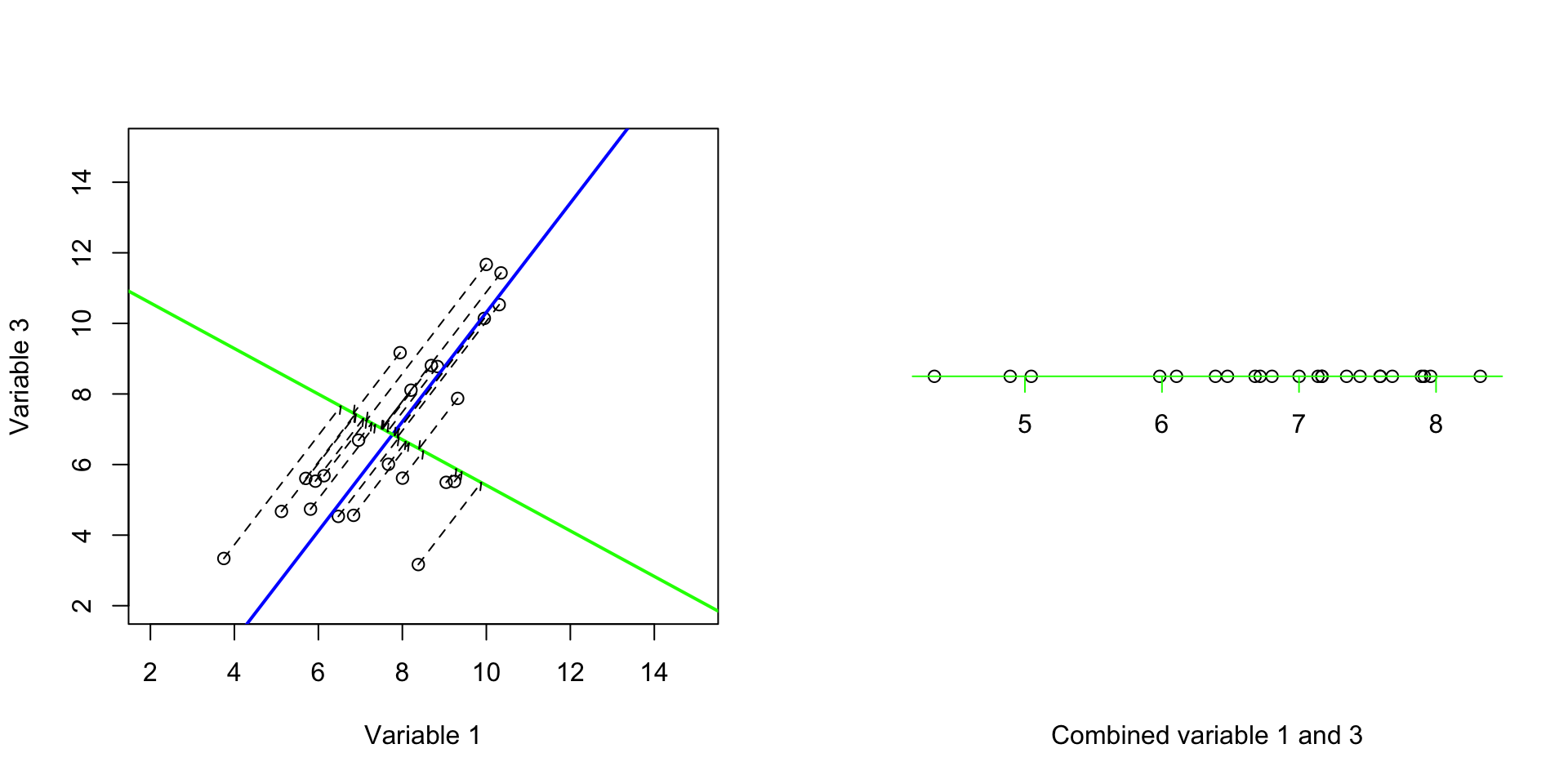
Figure 3.8: We try to fit the second best line through the data
Great! Now we have two new axes. The variance of the first one (blue) was 8.5999087 and the second one was 1.0644835. And most importantly, the covariance (redundancy) between these two new axis is 3.556493910^{-10}. That is almost zero. Perfect! We have two new variables that are showing complementary variance and no redundancy. Please also note that, our small two-variable dataset had a total variance of 9.6643921 and our new variables also have 9.6643921. So we did not remove anything! We just rotate the data along two new axes (blue and green) such that our first axis (blue) show us most of the variance and does not have covariance with our second variable. Now it’s time to plot both the new variables and see what they show us:
# fix number of columns in the plot
par(mfrow=c(1,2))
# define variables
var1<-18924
var3<-18505
# plot the data
plot(data[,c(var1,var3)],xlab = "Variable 1", ylab = "Variable 3",col=factor(metadata$Covariate),xlim=c(2,14),ylim=c(2,12))
title("Original variables")

# add legend
legend("topleft", legend=c(unique(levels(factor(metadata$Covariate)))),
       col=unique(as.numeric(factor(metadata$Covariate))), cex=0.8, pch = 1)

plot(decenter_data,xlab = "New variable 1", ylab = "New variable 2",col=factor(metadata$Covariate),xlim=c(2,14),ylim=c(2,12),axes = F)
box()
axis(1, col = 'blue' )
axis(2, col = 'green' )

title("New variables")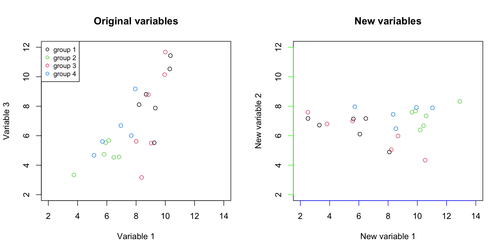
Figure 3.9: Plot of the original variables together with the new axis
It should be clear by now that we just rotated the data. But there is one more thing to this plot, in the left, the differences between groups are demonstrated by the values of two variables together (variable 1 and variable 3). However, in the panel on the right, the differences between the groups are mostly visible in just one variable (New variable 1, the blue line). So if we see the variance of interest in one variable, what is the reason to keep the other one? We can simply remove the New variable 2 and represent our data with only one variable.
# fix number of columns in the plot
par(mfrow=c(1,1))
# plot the data
plot(x=decenter_data[,1],y=rep(1.2,nrow(data)),axes = F,ylab = "",xlab = "New variable 1",col=factor(metadata$Covariate))
axis(1, col = 'blue',cex=4,pos=c(1,1),at =unique(c(floor(decenter_data[,1]),ceiling(decenter_data[,1]))) )

# add legend
legend("topleft", legend=c(unique(levels(factor(metadata$Covariate)))),
       col=unique(as.numeric(factor(metadata$Covariate))), cex=0.8, pch = 1)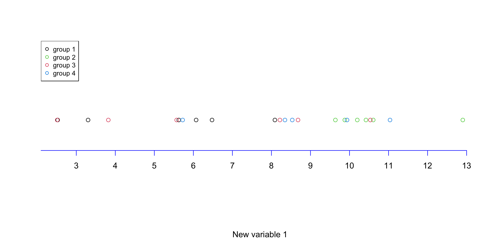
Figure 3.10: Plot of the data with one of the variables removed
We can see in Figure 3.10 that the differences are represented in one variable what is the combined effect of the two original variables. This might not sound such a big deal as one of our original variables (Variable 1) already represented the data very well. In addition, when removing the new variable 2, in fact we only remove 11 percent of the variance. Whereas if we remove either of the original variable 1 or 2, we will remove 34 or 66 percent respectively. Meaning that using the aforementioned method, we concentrated the variance in a limited number of variables. So removing the variable with little variance should not harm the overal data pattern. Reducing from two variables to one is not such a big deal! But how about reducing from 45101 variables to just a few ones? This is exactly what PCA does!
3.4 PCA (friendly definition)
PCA does exactly what we have been doing so far but it can do it for much much more complex data with thousands of variables (e.g. genes)! Its job is to find new variables from the combination of original variables and then sort them. It does that in a way that, after sorting, the first variable has the most variance (e.g. information), the second one has the second most and so forth. And all this amazing thing comes with the luxury of not having redundant variance between the new variables.
All these words mean that PCA will take your data, and rotate them and show you the angle of the data that you will see most of the differences between your observations (e.g. samples/patients/data points, etc). It does this unbiased, without knowing what you are interested in. It simply does not care! For PCA higher variance is better, it will simply show it first. That is exactly the reason why it’s a fantastic method for finding a hidden pattern in the data. We will go through a few examples in the next chapter.
In short, you can do the following with PCA:
- Visualization of high dimensional data: dimensions are normally the number of variables (e.g. genes) that are in the dataset
- Dimentionality reduction: exactly like we did here for removing variables
- Variable selection: selecting which of the variables (e.g. genes) has the most influence on the overall data pattern
- Batch removing: Batch effect or other experimental biases can be removed by PCA
We are going to go through all the above mentioned points in the next chapter.
See you!