Chapter 4 PCA (applications)
4.1 Summary of the previous chapter
We have already discussed what PCA does. This method is used to create a set of new variables that are a combination of the original variables. PCA then sort these variables in descending order with respect to their variance. The total variance of all new variables is always the same as the original ones. The new variables will be always orthogonal (no covariance, no redundancy). Simply talking, PCA rotates the data and shows a particular view of the data such that the user can see where most of the variance is sitting! One can later decide where this variance is of interest or not depending on the research question. At this stage, we would like to remind you about the dataset we are using. In our data we have 23 observations (e.g. samples/patients) and 45101 variables (e.g. measurements such as genes). The observation are coming from 4 groups: group 1, group 2, group 3, group 4 (e.g. cancer sub-types). We have been coloring our points in the plot based on these groups. Finally, this experiment was run in 2 batches (in the lab!). So let’s get started by doing some PCA!
4.2 PCA in R
We are going to use prcomp function in R to perform PCA. The main reason for selecting this function is simple. This is a function that is coming default with R, gives decent accuracy and is more or less accepted at the default method of doing a PCA in R. However, you should note that there are many more ways of doing a PCA in R, some of which provide much more functionalities compared to prcomp.
Before proceeding with using prcomp, it is important to organize your data correctly:
- From now on, your data is a matrix (like a table! although it’s sloppy to say that!)
- Your observations (e.g. samples) are in rows
- Your variables (e.g. measurements) are in column
If you ever wanted to use other functions, please do check in what format they need the data. This is important
So to give you an example, we show you part of our data:
# show 10 variables and all the samples
knitr::kable(as.data.frame(round(data[,1:5],2)),caption = "An example matrix where samples are in the rows and variables are in column")| V1 | V2 | V3 | V4 | V5 | |
|---|---|---|---|---|---|
| Sample1_Group1_Batch1 | 1.67 | 1.85 | 1.53 | 1.39 | 1.83 |
| Sample2_Group1_Batch1 | 1.44 | 1.71 | 1.76 | 1.53 | 2.06 |
| Sample3_Group1_Batch1 | 1.33 | 1.77 | 1.76 | 1.53 | 1.76 |
| Sample4_Group1_Batch1 | 1.54 | 1.95 | 1.73 | 1.48 | 1.76 |
| Sample5_Group3_Batch1 | 1.52 | 1.88 | 1.63 | 1.40 | 1.73 |
| Sample6_Group3_Batch1 | 1.76 | 1.65 | 1.82 | 1.53 | 1.74 |
| Sample7_Group3_Batch1 | 1.63 | 1.77 | 1.84 | 1.48 | 1.88 |
| Sample8_Group3_Batch1 | 1.59 | 1.65 | 1.63 | 1.58 | 1.69 |
| Sample9_Group3_Batch1 | 1.41 | 1.67 | 1.65 | 1.49 | 1.76 |
| Sample10_Group2_Batch1 | 1.54 | 1.77 | 1.53 | 1.48 | 1.63 |
| Sample11_Group2_Batch1 | 1.57 | 2.17 | 1.53 | 1.47 | 1.76 |
| Sample12_Group2_Batch1 | 1.47 | 1.79 | 1.83 | 1.47 | 1.56 |
| Sample13_Group2_Batch1 | 1.53 | 1.49 | 1.43 | 1.37 | 1.78 |
| Sample14_Group4_Batch1 | 1.50 | 1.74 | 1.58 | 1.50 | 1.77 |
| Sample15_Group4_Batch1 | 1.70 | 1.98 | 1.48 | 1.56 | 1.82 |
| Sample16_Group1_Batch2 | 2.17 | 2.49 | 2.40 | 2.28 | 2.54 |
| Sample4_Group1_Batch2 | 2.08 | 2.55 | 2.25 | 2.09 | 2.55 |
| SampleA_Group2_Batch2 | 2.28 | 2.71 | 2.44 | 2.26 | 2.35 |
| Sample10_Group2_Batch2 | 2.28 | 2.50 | 2.18 | 2.17 | 2.34 |
| Sample5_Group3_Batch2 | 2.20 | 2.48 | 2.27 | 2.17 | 2.33 |
| SampleB_Group4_Batch2 | 2.08 | 2.38 | 2.44 | 2.21 | 2.36 |
| SampleCGroup4_Batch2 | 2.02 | 2.31 | 2.20 | 2.16 | 2.43 |
| SampleD_Group4_Batch2 | 1.89 | 2.10 | 2.11 | 2.14 | 2.14 |
As you see in Table 4.1, the observations are in rows (e.g. Sample1_Group1_Batch1) and variables are in columns (e.g. V1).
By now you should know how to use functions in R. However, for just a brief reminder, a function is like a small program and does something. Exactly like in Microsoft Word where you click on some menus to for example to change the font. You then need to select the font, style, size, etc. These options, we tend to call them parameters or arguments. Normally functions in R need a few parameters in order to do exactly what you want. prcomp is no exception! Fortunately, the number of parameters that we will use is not too many:
- x: is your data matrix
- center: Shifts the variables to have zero mean (Don’t panic! See below)
- scale: Scales the variables to have unit variance (Scary huh?! See below)
That was it. We won’t use the rest of the parameters! You actually don’t need them unless you are doing something very special!
The way that we run a function in R is to write the name of the function then parenthesis open, add parameters (separated by comma), and parenthesis close! So for running a PCA we can do for example:
prcomp(x=x,center=TRUE,scale. = TRUE)This is normally referred to as calling a function. It says, run a PCA, with parameters, x equals to x, center is true and scale is also true. Many functions in R give the results of their jobs in some form. We normally say they return something. So we can even be cooler and save the returned results somewhere so we can use it.
pcaResults <- prcomp(x=x,center=TRUE,scale. = TRUE)As said before, x is your data matrix that we have already prepared.
4.3 Centering
We have a set of variables (e.g genes) in our data. If we set centering to TRUE, R, first, will calculate the average of each variable and then subtract this average from the values of the variable (for each observation, e.g. sample).
In short, it will shift the data so that the center of our data is zero. We can see an example of this for ten of our variables:
# set number of figures
par(mfrow=c(1,2))
# show 10 variables and all the samples
boxplot(data[,1:10],xlab="Variable",ylab="Variable value (e.g. expression)")
title("Original data")
# calculate the means
means <- apply(data[,1:10],2,mean)
#plot the means
points(x=1:10,y = means,col="red",pch=18)


# show 10 variables and all the samples but centered
boxplot(scale(data[,1:10],center = TRUE, scale = FALSE),xlab="Variable",
        ylab="Variable value (e.g. expression)")
title("Centered data")
# calculate the means
means <- apply(scale(data[,1:10],center = TRUE, scale = FALSE),2,mean)
#plot the means
points(x=1:10,y = means,col="red",pch=18)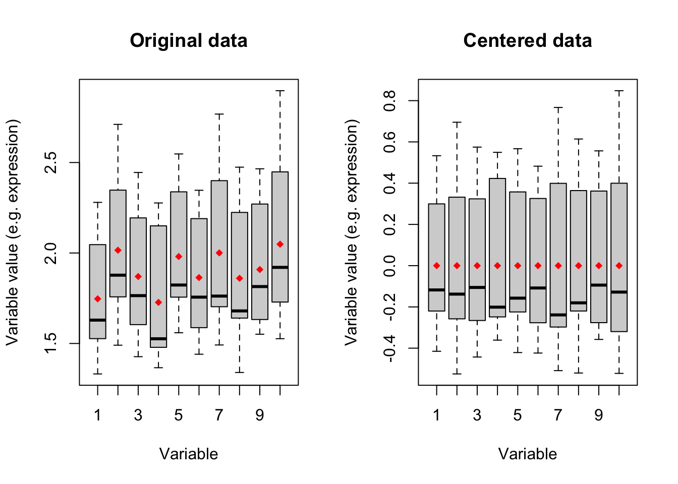
Figure 4.1: Boxplot of ten variables before and after centering
Figure 4.1 shows boxplots of ten variables in our data. The left panel is showing the original data where the mean of each variable has been showing in red diamonds. In the right panel, we see that after centering the mean of all variables becomes zero. We will go through this in detail later. for now:
IMPORTANT: You MUST center your data for doing PCA. If your data is not centered, you are NOT doing PCA.
Setting the center parameters to TRUE will force prcomp to center your data automatically. DO NOT set this to FALSE if you are not sure whether your data is centered
4.4 Scaling
Many datasets typically come in different scales and this happens even within a dataset. That means that if I measure three variables (e.g genes), the scale of the measurements can be different between these three. This is especially the case for high throughput experiments where thousands of variables are measured at the same time. A mini example would be one person measuring height in centimeter and another one measuring height in meter. Scaling is a way of forcing your variables to show one unit scale. One common way of doing this is to calculate the standard deviation (square root of variance) of each variable and divide the variable by this standard deviation. Let’s see if we can demonstrate what it means with an example:
# set number of figures
par(mfrow=c(1,2))

# create two variables
varibale1<-data[,var1]
varibale2<-data[,var1]*10

# create a data frame
dataDummy<-data.frame(Variable1=varibale1,Variable2=varibale2)


# show 10 variables and all the samples
boxplot(dataDummy,xlab="Variable",ylab="Variable value (e.g. expression)")

# plot scatter
plot(dataDummy)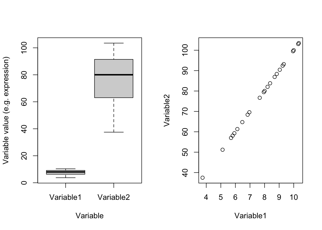
Figure 4.2: Example of two variables with different scales
In Figure 4.2(left panel) which one of these two variables has most of the variance? Well, you are right! Variable2 has 328.2277629 whereas Variable1 has 3.2822776. Remember what PCA shows: the angle with most of the variance. Obviously, this is going to be Variable2. There is one point and i guess you also see it in the code. These two variables are identical except that Variable2 equals to Variable1 multiply by 100. You can see that in the scatter plot in the right panel. These two variables are identical. Let’s see the effect of scaling:
# set number of figures
par(mfrow=c(1,2))

# create two variables
varibale1<-data[,var1]
varibale2<-data[,var1]*10

# create a data frame
dataDummy<-data.frame(Variable1=varibale1,Variable2=varibale2)

# scale the data, not center
dataDummy<-scale(dataDummy,center = FALSE, scale = TRUE)

# show 10 variables and all the samples
boxplot(dataDummy,xlab="Variable",ylab="Variable value (e.g. expression)")

# plot scatter
plot(dataDummy)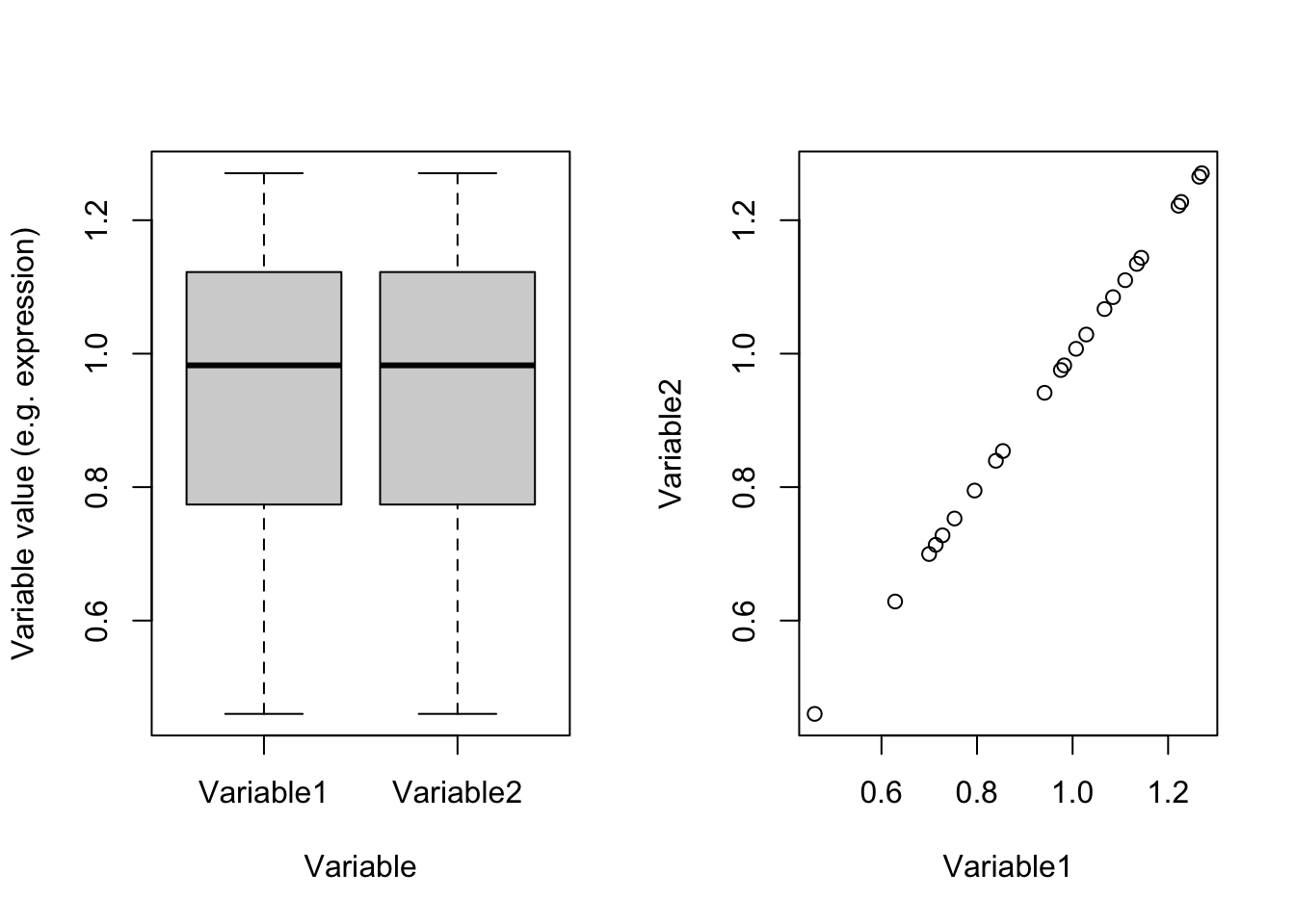
Figure 4.3: Example of two variables which are scaled
Perfect! right?! Now we see that they are identical and obviously have the same variance (0.0494634). So we were fooled by scales. If we have thousands of variables and just one or two of them are coming from different scales compared to the rest, PCA would also have been fooled and showed us only those two variables! So the point is:
If you don’t know your variables are in the same scale, set scale to TRUE
The rule of thumb is that, if you don’t know anything about your data, set both scale and center to TRUE. You will be probably safe :)
Now it’s time to use PCA to do something.
# do pca
pcaResults<-prcomp(data,scale. = T,center = T)

# convert pca result to dataframe
pcaResults_table<-data.frame(Elements = names(pcaResults),
           Classes = sapply(pcaResults, function(x)class(x)[1]),
           row.names = c(2,3,4,5,1))

# make a table
knitr::kable(pcaResults_table[order(rownames(pcaResults_table)),],caption = "PCA output classes")| Elements | Classes |
|---|---|
| x | matrix |
| sdev | numeric |
| rotation | matrix |
| center | numeric |
| scale | numeric |
PCA gives you a list. A list in R can be thought of a database that keeps many different types of information for you (called elements). You can see what type of information is in the result (list) of PCA in table 4.2. The single elements of the PCA list can be accessed using the dollar sign ($) which comes immediately after the name of the list.
For example, if you want to see the values of x, it can be accessed by
pcaResults$xOr rotations can be accessed by
pcaResults$rotationIn the next sections, we will use these elements to investigate our data.
4.5 Visualization of data and dimensionality reduction
One of the primary aspects of pattern recognition is to visually look at the data and see how the observations (samples) have been spread compared to each other. Do we see our treatment to be well separated from our control groups (potentially indicating a treatment effect)? Do we see a gradient of sample spread with respect to the dose of a drug we gave to the patients? Do we have any unnoticed experimental bias? The list of questions can go on and on and it’s pretty much impossible to list them all. The key point here is that for the reasons that we previously mentioned, it’s difficult to look at the original data mainly due to a large number of variables, and in addition, maybe the effect of interest is not “caused” by one variable but a combination of different variables. We can use PCA (or similar methods) to squeeze the data into a set of limited variables that is easier to look at.
These new variables are in x element of our PCA result. These are normally called PC scores or variates or x.
Let’s have a look at this:
# make a table
knitr::kable(pcaResults$x[,1:5],
caption = "PCA output Scores (only top 5 are shown)")| PC1 | PC2 | PC3 | PC4 | PC5 | |
|---|---|---|---|---|---|
| Sample1_Group1_Batch1 | -142.4977 | -20.151157 | 7.364239 | -23.7018049 | 4.9708775 |
| Sample2_Group1_Batch1 | -135.2110 | -50.462934 | 43.692008 | -4.1229620 | -1.9423228 |
| Sample3_Group1_Batch1 | -139.0443 | -61.125761 | -4.613422 | 38.4579480 | -22.1566490 |
| Sample4_Group1_Batch1 | -140.9501 | 8.041048 | 17.950046 | -37.9425775 | 15.5112450 |
| Sample5_Group3_Batch1 | -139.9421 | 36.752186 | 21.762929 | 18.2192019 | 4.6907520 |
| Sample6_Group3_Batch1 | -143.9337 | -13.608741 | 1.569605 | 36.2175322 | 12.1779967 |
| Sample7_Group3_Batch1 | -133.4457 | 7.473995 | 6.967519 | 32.2483403 | 56.7414888 |
| Sample8_Group3_Batch1 | -141.5472 | 16.808439 | 12.889779 | 11.4550017 | 0.0100097 |
| Sample9_Group3_Batch1 | -139.4096 | 41.871771 | 4.580464 | -3.7737890 | 6.0779133 |
| Sample10_Group2_Batch1 | -146.9726 | -11.140862 | -38.872539 | -21.4178914 | -11.5489616 |
| Sample11_Group2_Batch1 | -142.0313 | 2.452566 | 20.086084 | -8.0942913 | -29.6993857 |
| Sample12_Group2_Batch1 | -141.3450 | -22.237362 | 9.148693 | -1.5475102 | 0.9198088 |
| Sample13_Group2_Batch1 | -143.9038 | -1.859245 | 2.014499 | -26.7160541 | -10.9344309 |
| Sample14_Group4_Batch1 | -147.4363 | 35.800426 | -38.092775 | -12.0340459 | -0.2656263 |
| Sample15_Group4_Batch1 | -139.3653 | 30.648049 | -64.715916 | 4.0801686 | -23.3560720 |
| Sample16_Group1_Batch2 | 266.2316 | -38.382633 | -28.188729 | -9.7919721 | 38.3088649 |
| Sample4_Group1_Batch2 | 264.8721 | 6.932182 | 50.200805 | -47.9462872 | -2.1211571 |
| SampleA_Group2_Batch2 | 263.1922 | -21.574565 | -32.166062 | -16.5126360 | 14.7941615 |
| Sample10_Group2_Batch2 | 264.0484 | -40.878854 | -34.106663 | 2.0871555 | -15.0694882 |
| Sample5_Group3_Batch2 | 264.1643 | 6.182041 | 23.738773 | 28.2694399 | -22.8995487 |
| SampleB_Group4_Batch2 | 263.8839 | 41.230650 | -12.071945 | 0.3629786 | 0.8558170 |
| SampleCGroup4_Batch2 | 265.4505 | 17.661788 | 26.862815 | 19.4137281 | -20.7695081 |
| SampleD_Group4_Batch2 | 265.1927 | 29.566972 | 3.999793 | 22.7903267 | 5.7042151 |
You can see in Table 4.3 that the observation is in rows and the new variables (new axis) are in columns. The total number of the new axis can be a maximum of 23 which is the total number of observations we have in the dataset.
So we have 23 new variables. If you remember, we said that PCA sorts these new variables so that the first one is the one showing most of the variance. The second one is showing the next largest variance and so forth.
You can see the standard deviation of these new axes in
pcaResults$sdevEach element of pcaResults$sdev corresponds to the standard deviation of the same variable in pcaResults$x. This means pcaResults$sdev[1] is the standard deviation of the first column of pcaResults$x. The same thing for the second one, pcaResults$sdev[2] is the standard deviation of the second column of pcaResults$x. Here we refer to each column of x as a component. So component 1 means the new variable 1 that has been created by PCA.
Intuitively, as we are interested in most of the variance, we go ahead and plot the first two components of PCA.
# set number of figures
par(mfrow=c(1,1))

# calculate variance explained
x.var <- pcaResults$sdev ^ 2
x.pvar <- x.var/sum(x.var)
x.pvar<-x.pvar*100
# plot the first two components
plot(pcaResults$x[,1:2],xlab=paste("PC1, var.exp:",round(x.pvar[1]),"percent"),
     ylab=paste("PC2, var.exp:",round(x.pvar[2]),"percent"))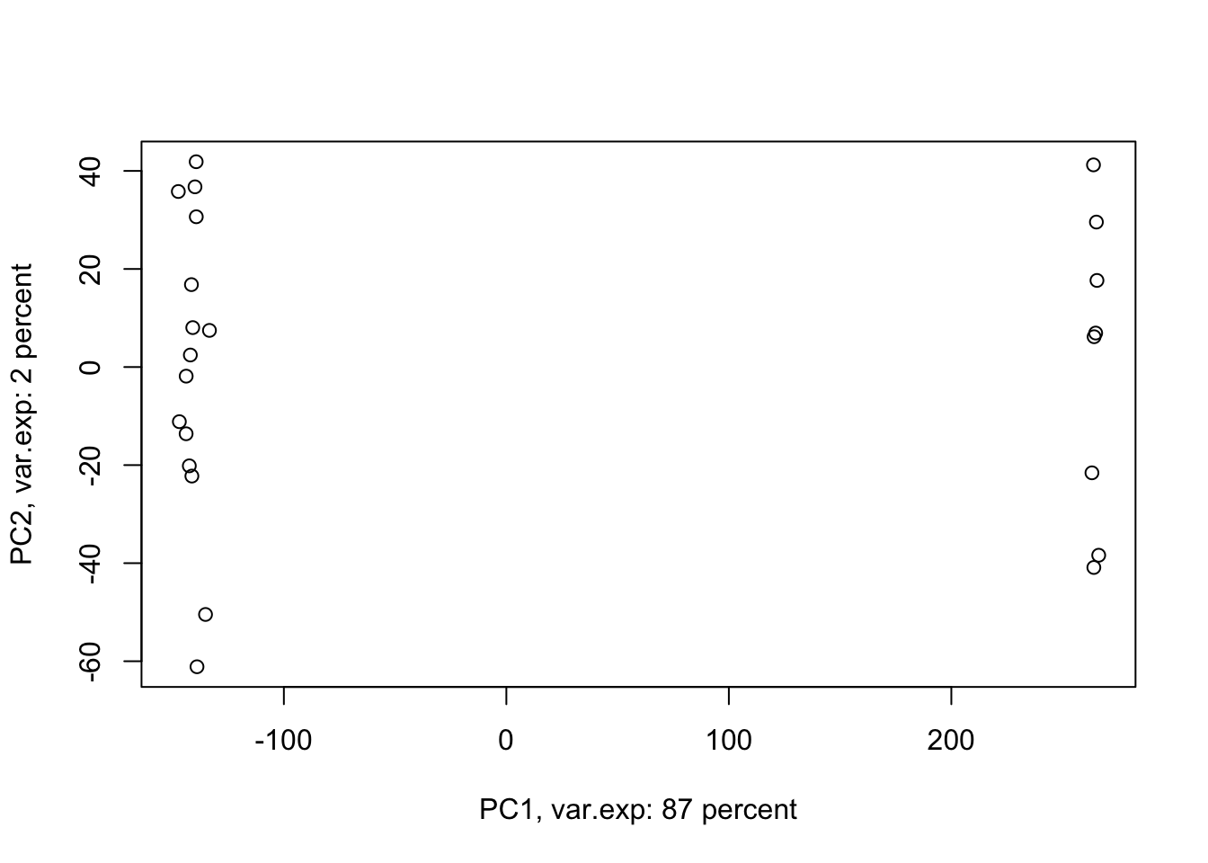
Figure 4.4: PCA of the data using first two components
Amazing. This is our PCA results. Here in Figure ’@ref(fig:pcaexample1), the x-axis is component 1 and the y-axis is component 2 of the PCA. We can see that the first component alone shows us 87 percent of the total variance in our dataset. This is amazing! we have had 45101 variables with a total of 3.034990810^{4} variance. Now we can see 87 percent of the variance (2.628180310^{4}) in only one variable! And look, the second component only explains 2 percent of the total variance so it’s not even that important compared to the first one. But hold on, we first need to see what this new variable actually shows us? Here the statistics do not help much, we as researchers should make sense of this component. By adding shapes, colors, etc to the figure, we can start making sense of this.
Let’s add our group information first:
# set number of figures
par(mfrow=c(1,1))

# calculate variance explained
x.var <- pcaResults$sdev ^ 2
x.pvar <- x.var/sum(x.var)
x.pvar<-x.pvar*100
# plot the first two components
plot(pcaResults$x[,1:2],xlab=paste("PC1, var.exp:",round(x.pvar[1]),"percent"),
     ylab=paste("PC2, var.exp:",round(x.pvar[2]),"percent"),col=factor(metadata$Covariate))
# add legend
legend("top", legend=c(unique(levels(factor(metadata$Covariate)))),
       col=unique(as.numeric(factor(metadata$Covariate))), cex=0.8, pch = 1)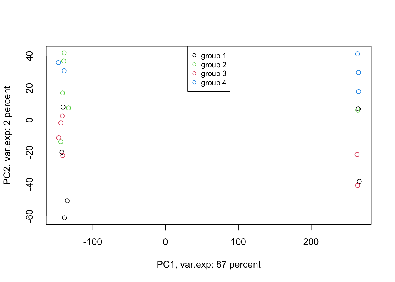
Figure 4.5: PCA of the data using first two components
Well, OK. Perhaps not something that we actually expected. The largest variance in our data is not coming from differences between our biological groups (e.g. cancer sub-types). Our group of interest is only visible in component 2. Remember, we discussed that PCA is great for finding patterns, the ones that we don’t expect, in an unbiased manner! There is something else in our data that we ignore! That is:
# set number of figures
par(mfrow=c(1,1))

# calculate variance explained
x.var <- pcaResults$sdev ^ 2
x.pvar <- x.var/sum(x.var)
x.pvar<-x.pvar*100
# plot the first two components
plot(pcaResults$x[,1:2],xlab=paste("PC1, var.exp:",round(x.pvar[1]),"percent"),
     ylab=paste("PC2, var.exp:",round(x.pvar[2]),"percent"),col=factor(metadata$Covariate),pch=as.numeric(factor(metadata$Batch)))
# add legend
legend("center", legend=paste("Batch",c(unique(levels(factor(metadata$Batch))))),
       pch=unique(as.numeric(factor(metadata$Batch))), cex=0.8)
# add legend
legend("top", legend=c(unique(levels(factor(metadata$Covariate)))),
       col=unique(as.numeric(factor(metadata$Covariate))), cex=0.8, pch = 1)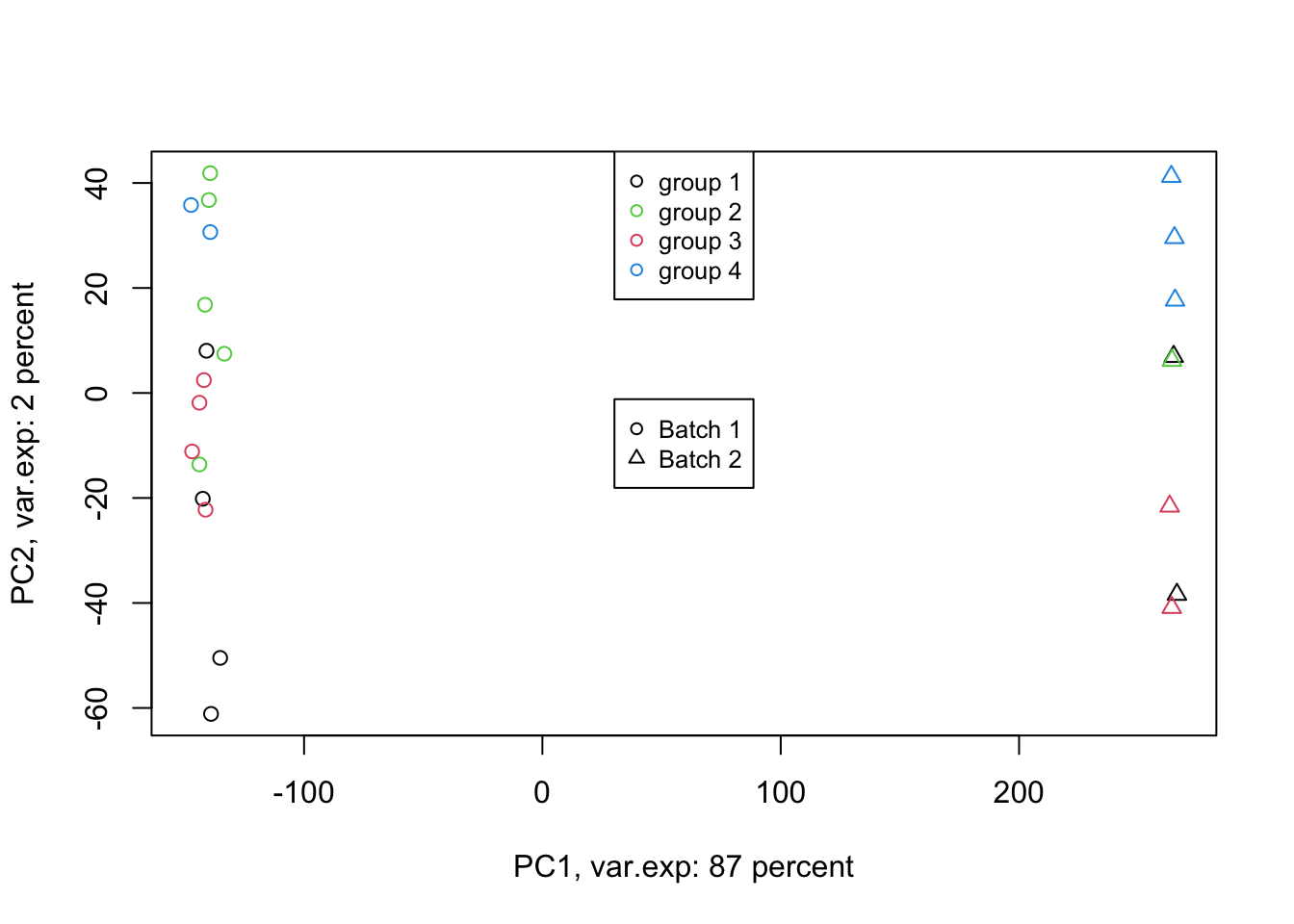
Figure 4.6: PCA of the data using first two components (v2)
Exactly. We have such a large batch effect between our samples. That is our largest variance. What should we do. Well, we can ignore it go to the next components. Let’s go up to ten components:
# set number of figures
par(mfrow=c(1,1))

# calculate variance explained
x.var <- pcaResults$sdev ^ 2
x.pvar <- x.var/sum(x.var)
x.pvar<-x.pvar*100
# plot the first two components
pairs(pcaResults$x[,c(2:10)],
      col=factor(metadata$Covariate),pch=as.numeric(factor(metadata$Batch)))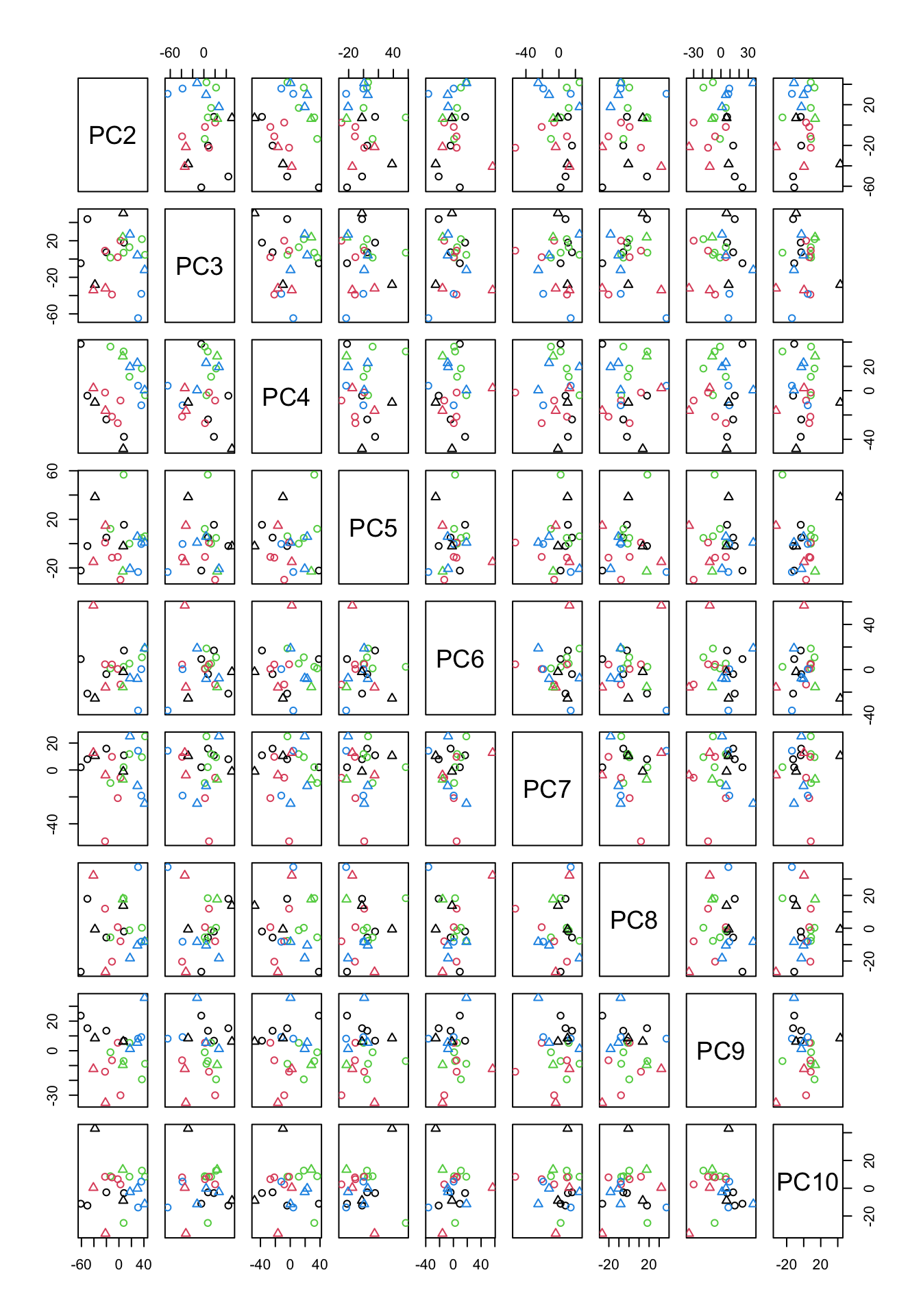
Figure 4.7: PCA of the data using up to ten components
In Figure 4.7, we have plotted all possible pairs of components from 2 to 10. This might look scary a bit but If we take a plot in Figure 4.7 which has data points in it, we can figure out what is the x-axis but just going up and down and look what “PC” is on that column. The same for the y-axis. We can just go left and right and figure out which PC is in that row. The combination of PC2 and PC9 looks interesting as they show some group differences.
Let’s plot them:
# set number of figures
par(mfrow=c(1,1))

# calculate variance explained
x.var <- pcaResults$sdev ^ 2
x.pvar <- x.var/sum(x.var)
x.pvar<-x.pvar*100
# plot the first 2 and 9 components
plot(pcaResults$x[,c(2,9)],xlab=paste("PC2, var.exp:",round(x.pvar[2]),"percent"),
     ylab=paste("PC9, var.exp:",round(x.pvar[3]),"percent"),col=factor(metadata$Covariate),
     pch=as.numeric(factor(metadata$Batch)))
# add legend
legend("top", legend=c(unique(levels(factor(metadata$Covariate)))),
       col=unique(as.numeric(factor(metadata$Covariate))), cex=0.8, pch = 1)

# add legend
legend("topleft", legend=paste("Batch",c(unique(levels(factor(metadata$Batch))))),
       pch=unique(as.numeric(factor(metadata$Batch))), cex=0.8)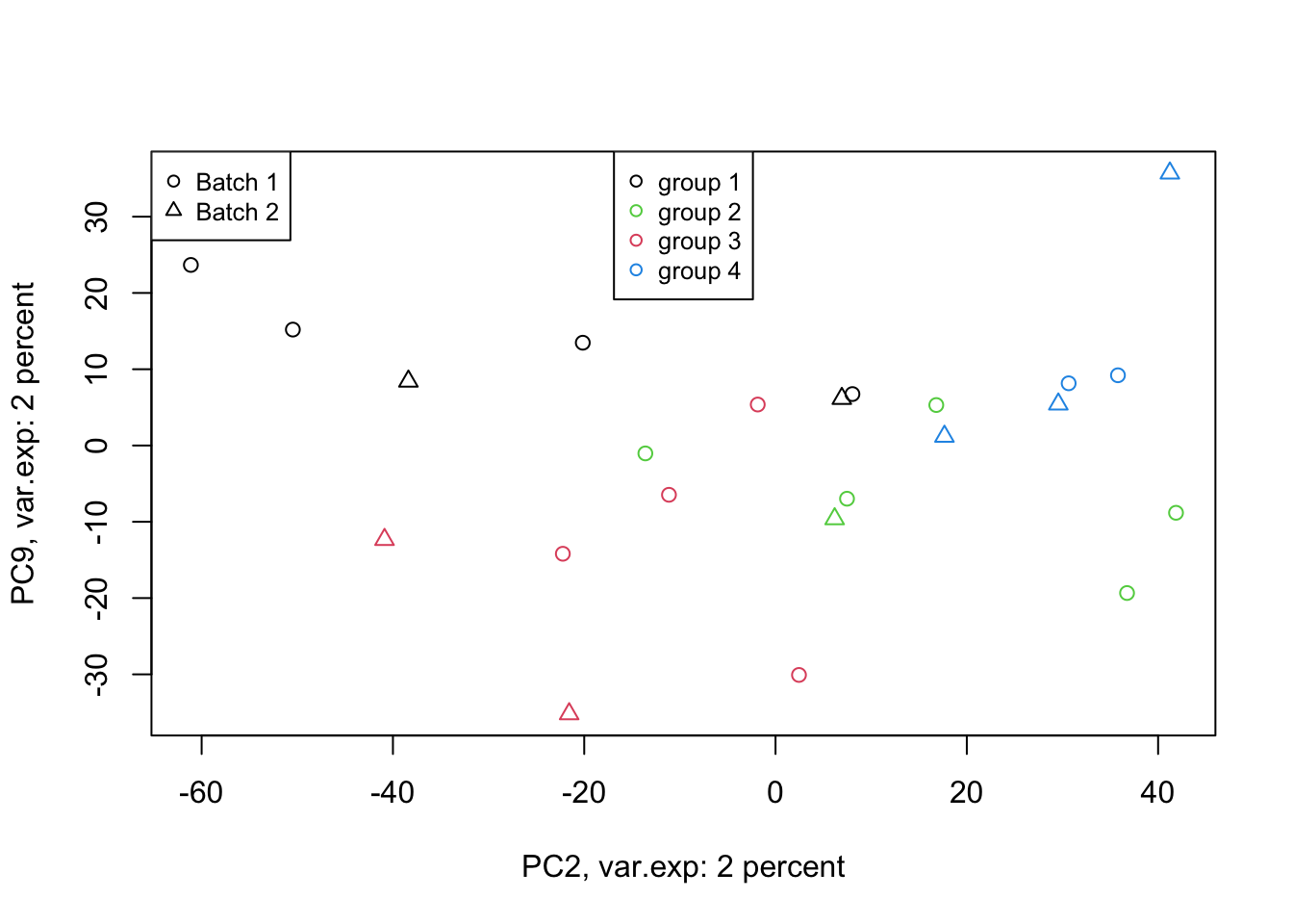
Figure 4.8: PCA of the data 2 and 9 components
That is not that bad! We can see differences between groups of interest and not the batch effect. So we can conclude that there are certainly some differences between the groups but it’s much lower than our experimental factors (such as batch or others that we don’t know!). So our experiment has been successful. Please also note that, if you see the variance of interest in the first components, it’s generally a good sign (unless there is confounding somewhere) as PCA found what you wanted without knowing it, meaning that the signal has been very strong compared to noise! Now we want to move one step back and ask given the differences we see in these new variables, what can we say about the original variables (e.g. genes). Are there some genes specific responsibility for these differences that we see? Or What are the genes that are influenced by group (cancer sub-types) or even batches? This is the topic of the next section.
4.6 Variable selection
In many experiments, we are not only interested in seeing whether the experiment has been successful, but we are also interested in know whether any of the measurements (variables) have been affected let’s say by some kind of perturbation? Variable selection is the key to answer this question. In short, we are going to single out the variables that might be of interest for further investigation. Some examples can be performing a t-test or regression and deciding which variables are “statistically significant”. PCA also gives us a tool to do so. However, it does that without a need to do statistical testing.
If we recall, in Table 4.3, we had another element (returned by PCA) that is called rotation. What are these? We have been repeatedly saying that PCA creates new variables that are combinations of the original variable. We can think about a combination like New variable (let’s say component 1) = original variable 1 + original variable 2 + original variable 3. However, PCA adds a little more! It adds weights to the original variables and then combines them. So the new variable is the weighted combination of the original ones. These weights in each component are indications of the importance or influence of a particular variable on the data pattern we see in a component. These weights can be positive or negative, but for now, the larger the absolute value, the more interesting the variable is for us. In the end please note that these weights rotations are also called loadings in many contexts (when they are weighted by standard deviation of each component. It’s often nice to work with loadings as they show how much of load (variation) the new variables have.
Having this said let’s have a look at the rotation:
# make a table
knitr::kable(pcaResults$rotation[1:5,1:5],
caption = "PCA output rotation (only top 5 are shown)")| PC1 | PC2 | PC3 | PC4 | PC5 |
|---|---|---|---|---|
| 0.0046596 | -0.0015491 | -0.0050678 | -0.0013241 | 0.0030454 |
| 0.0044884 | -0.0020155 | -0.0023613 | -0.0061551 | -0.0025862 |
| 0.0046884 | -0.0038413 | 0.0016769 | 0.0037431 | 0.0104244 |
| 0.0049866 | -0.0010551 | -0.0030093 | 0.0018562 | 0.0009776 |
| 0.0047319 | -0.0029789 | 0.0029067 | -0.0035312 | 0.0034596 |
In Table 4.4, we only show five variables (weights) for five components but in fact there are 23 components (PCs) for each we have 45101 weights. The way we do variable selection is, for the component of interest we sort the absolute values of these weights in descending order, and then select top x highest variables (let’s say top 5 if we only want 5 variables). For this experiment, we have already select component 2 and 9 to be important for us. Now let’s select the top 5 variables for each component.
# set number of figures
par(mfrow=c(2,1),las=2)

# extract rotation
PC2_rotations<-pcaResults$rotation[order(abs(pcaResults$rotation[,2]),decreasing = T)[1:5],2]

# scale rotation
PC2_rotations<-PC2_rotations*pcaResults$sdev[2]

names(PC2_rotations)<-as.character(order(abs(pcaResults$rotation[,2]),decreasing = T)[1:5])
PC2_rotations<-rev(abs(PC2_rotations))
barplot(PC2_rotations,horiz=TRUE,main = "Component 2")
# add legend
# set number of figures


PC9_rotations<-pcaResults$rotation[order(abs(pcaResults$rotation[,9]),decreasing = T)[1:5],9]

PC9_rotations<-PC9_rotations*pcaResults$sdev[9]

names(PC9_rotations)<-as.character(order(abs(pcaResults$rotation[,9]),decreasing = T)[1:5])
PC9_rotations<-rev(abs(PC9_rotations))
barplot(PC9_rotations,horiz=TRUE,main = "Component 9")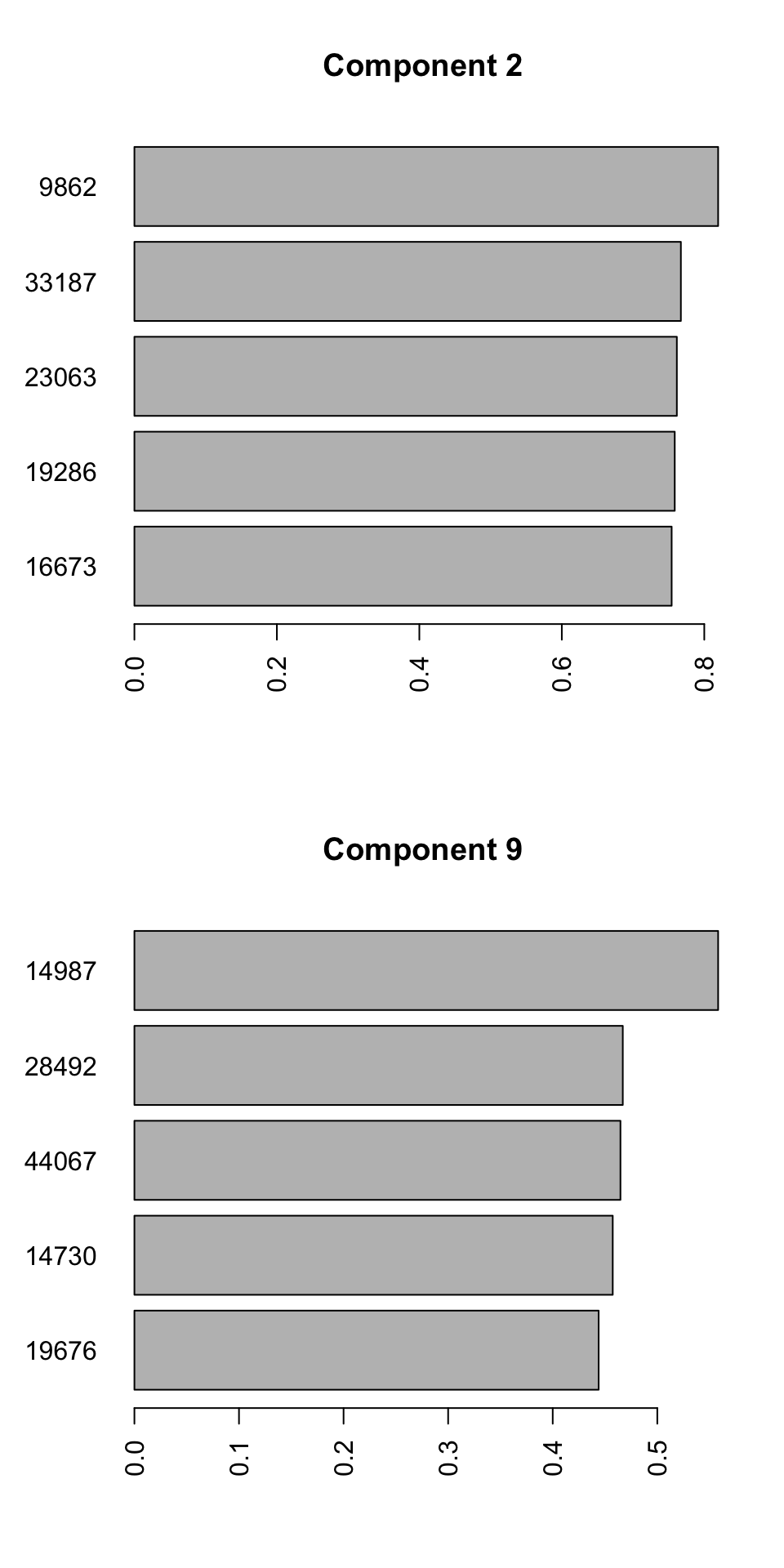
Figure 4.9: Selecting top five variables for components 2 and 9
We can see the name of the variable on the y-axis and its contribution to the x-axis. So we have 10 unique variables (the variables can sometime overlap between different components). We will have to interpret these variables together with components. Because we see differences between groups 2, 3, and 4 in the second component, variables selected for this component influence the differences between the mentioned groups. The variables selected for component 9, will mostly influence the differences between group 1 and the rest. It will take some time to get used to this kind of interpretation but after a while, it will become very convenient to do variable selection using PCA. This way, we can avoid doing statistical testing, and thus avoid multiple testing problem. In addition, we can easily remove variables to avoid for example overfitting of statistical models and many other advantages. We can have a look at the variables we selected in isolation:
# set number of figures
par(mfrow=c(2,5))

for(x in names(sort(PC2_rotations,decreasing = T)))
{
  # plot the data
  dt<-data[,as.numeric(x)]
plot(x=dt,y=rep(1,nrow(data)),axes = F,ylab = "",xlab = paste("PC2,",x,sep=""),col=factor(metadata$Covariate))
axis(1,cex=4,pos = c(0.9,0.5) )

}

for(x in names(sort(PC9_rotations,decreasing = T)))
{
  # plot the data
  dt<-data[,as.numeric(x)]
plot(x=dt,y=rep(1,nrow(data)),axes = F,ylab = "",xlab = paste("PC9,",x,sep=""),col=factor(metadata$Covariate))
axis(1,cex=4,pos = c(0.9,0.5) )

}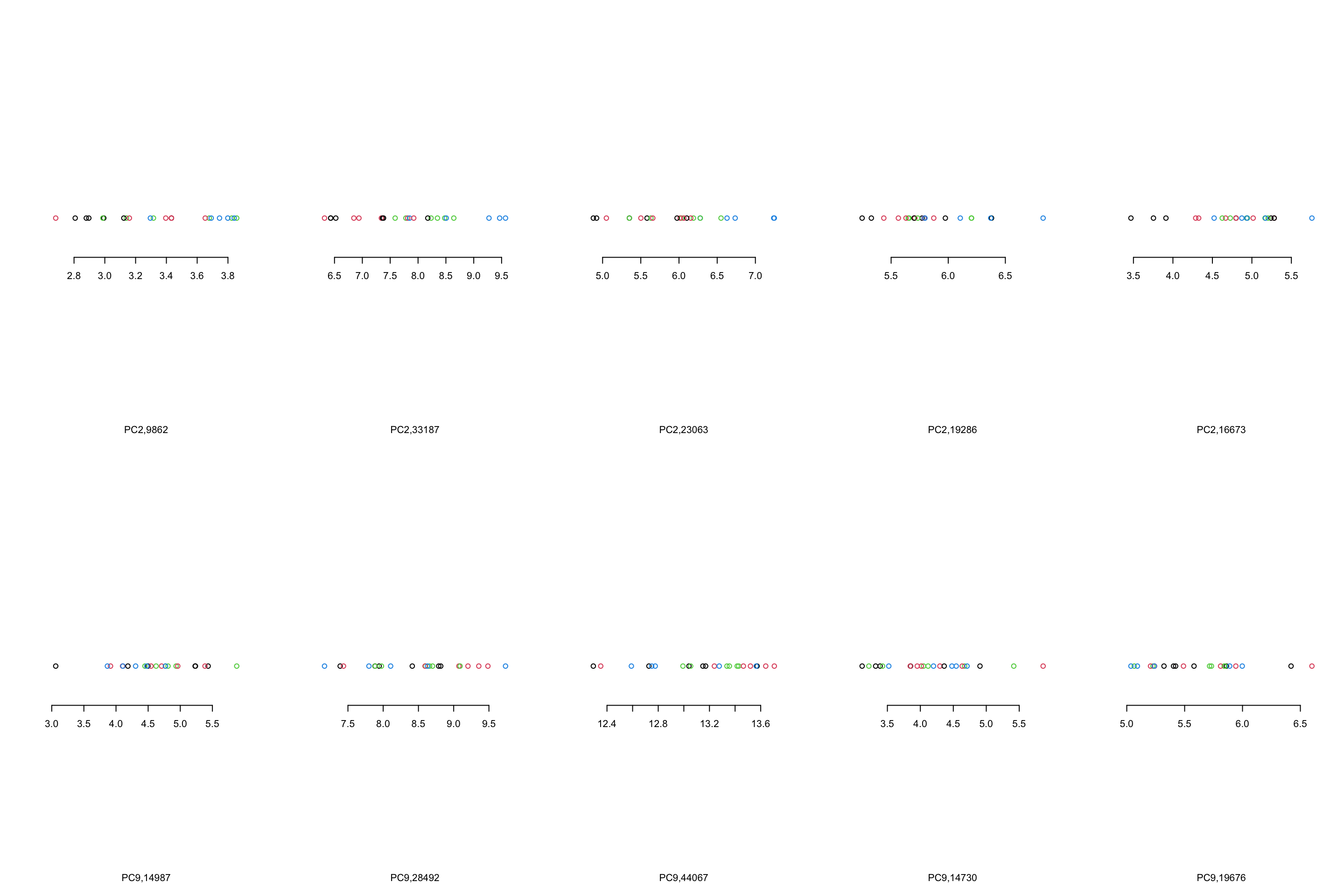
Figure 4.10: Top 5 variables per component are plotted
We can see that, in the case of component 2, most variables show the same trend that component 2 showed us. However, This is not the case in component 9 where there are only one or maybe two variables (28492 and 44067) that showed what component 9 showed. There are several reasons for this, including:
- PCA looks where most of the variance is without knowing about the groups. We can see that there is a single observation in for example variable 14987 that is very different compared to the rest of the observation.
- PCA components are combinations of all the variables. Simply because we chose to select the top five variables does not mean the rest of the variables are not influencing the pattern
- From the PCA perspective, these variables are top ones. This does not mean that they will answer our research question. That is of course up to us what to conclude!
- The distances between the observations in the PCA components would have been the same as the original data IF you did not remove any components. Now that we decided to remove some components, the distances are not the same.
By now you should have a good understanding of application PCA for dimensionality reduction and visualization. We could squeeze our dataset with 45101 variables to a few ones still showing the overall data pattern. We could also extract variables with the most influence on the data for the purpose of further investigations.
There is one more thing about variable selection. There is a nice plot called biplot that is used to visualize both loadings and PC scores inside one plot.
par(mfrow=c(1,1))

# select which components to plot
selected_comps<-c(2,9)
# extract sds
lam <- pcaResults$sdev[selected_comps]
# extract scores
scores<-pcaResults$x

plot(t(t(scores[, selected_comps])/lam),xlab=paste("PC2, var.exp:",round(x.pvar[2]),"percent"),
     ylab=paste("PC9, var.exp:",round(x.pvar[3]),"percent"),col=factor(metadata$Covariate),
     pch=as.numeric(factor(metadata$Batch)))
# add legend
legend("top", legend=c(unique(levels(factor(metadata$Covariate)))),
       col=unique(as.numeric(factor(metadata$Covariate))), cex=0.8, pch = 1)

# add legend
legend("topleft", legend=paste("Batch",c(unique(levels(factor(metadata$Batch))))),
       pch=unique(as.numeric(factor(metadata$Batch))), cex=0.8)

for(x in unique(as.numeric(c(names(PC2_rotations),names(PC9_rotations)))))
{
  arrows(x0 = 0,y0 = 0,length = 0.1,
         x1 = pcaResults$rotation[x,selected_comps[1]]*pcaResults$sdev[selected_comps[1]],y1 = pcaResults$rotation[x,selected_comps[2]]*pcaResults$sdev[selected_comps[2]],
         lwd = 0.5)

  text(pcaResults$rotation[x,selected_comps[1]]*pcaResults$sdev[selected_comps[1]], pcaResults$rotation[x,selected_comps[2]]*pcaResults$sdev[selected_comps[2]],
      labels = x ,adj = 2,cex = 0.5)

}

 arrows(x0 = 0,y0 = 0,length = 0.1,
         x1 = pcaResults$rotation[x,selected_comps[1]]*pcaResults$sdev[selected_comps[1]],y1 = pcaResults$rotation[x,selected_comps[2]]*pcaResults$sdev[selected_comps[2]],
         lwd = 0.5,col = "red")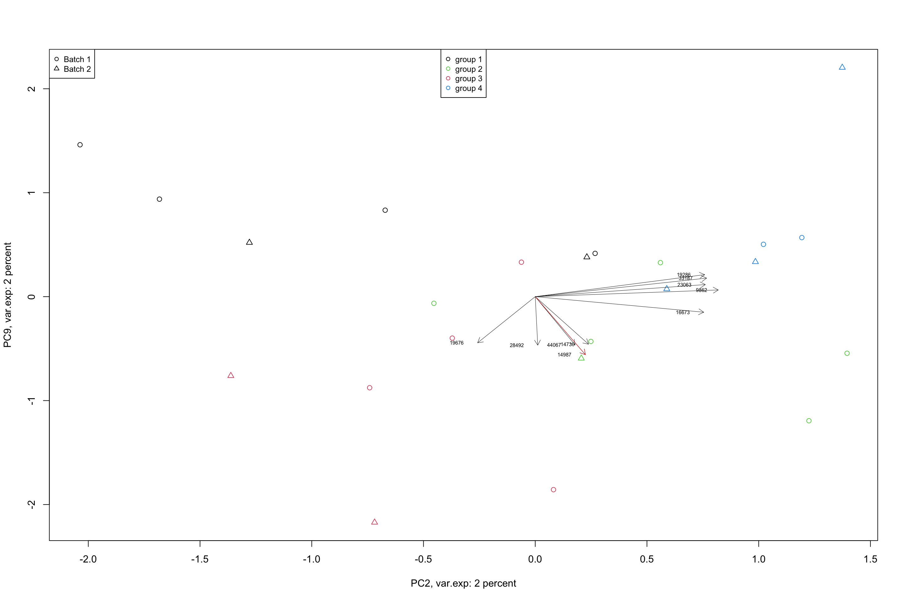
Figure 4.11: Top 5 variables per component are plotted using biplot
In a biplot, the component scores are showing as points (shapes) and the loadings as arrows. The length of the arrow shows the magnitude of the influnece of that particular variable on the spread of a component. The direction of the arrows show the sign of the loadings. If two arrows are pointing to the same direction, it means that the variables associated with these arrows have positive covariance in the original dataset. If they are pointing to opposite directions, they will have negative covariance and if they are orthogonal, they might have very little covariance. We will see later in the math section that, loadings are actually covariance or correlation between the original data and the component scores. But so far, we just take them as the measure of how they influence the spread of the data in a particular component.
We could stop here and you are good to start using PCA. But there is one more thing to talk about. Let’s move to the last section of this chapter.
4.7 Batch removing (removing variance)
Working with PCA components is nice, they are standardized, they have a specific meaning but there are situations that we want to work on the original data. However, maybe we find a variance of interest in a few PCA components and we have to keep that variance and remove the rest. Or it also can be that we found a variance that is not of interest and we want to remove it and keep the rest. The example would the batch effect that we saw before. Maybe we want to remove the batch effect from our data. PCA will give us a very powerful tool to do so. Let’s have another look at the previous batch effect. We also select the top two variables affected by the batch effect and plot them
# set number of figures
par(mfrow = c(1, 2))

# calculate variance explained
x.var <- pcaResults$sdev^2
x.pvar <- x.var/sum(x.var)
x.pvar <- x.pvar * 100
# plot the first two components
plot(pcaResults$x[, 1:2], xlab = paste("PC1, var.exp:", round(x.pvar[1]), "percent"),
    ylab = paste("PC2, var.exp:", round(x.pvar[2]), "percent"), pch = as.numeric(factor(metadata$Batch)))
# plot title
title("PCA batch effect")

# add legend
legend("top", legend = paste("Batch", c(unique(levels(factor(metadata$Batch))))),
    pch = unique(as.numeric(factor(metadata$Batch))), cex = 0.8)

#
PC1_rotations <- pcaResults$rotation[order(abs(pcaResults$rotation[, 1]), decreasing = T)[1:2],
    1]

names(PC1_rotations) <- (order(abs(pcaResults$rotation[, 1]), decreasing = T)[1:2])

plot(data[, (order(abs(pcaResults$rotation[, 1]), decreasing = T)[1:2])], xlab = paste("Variable",
    names(PC1_rotations)[1]), ylab = paste("Variable", names(PC1_rotations)[2]),
    pch = as.numeric(factor(metadata$Batch)))
title("Original variables")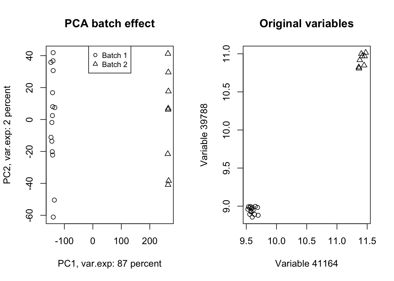
Figure 4.12: PCA of the data showing the batch effect in our data
Wow! Look at how the variables have been affected by the batch effect. Now we do a trick (we will go through this in detail later) and ignore component one and tell PCA to rebuild our dataset without that component but including all other components.
# set number of figures
par(mfrow=c(1,2))

# Reconstruct the data without the first component
new_data<-pcaResults$x[,-1]%*%t(pcaResults$rotation[,-1])

# rescale and recenter the data
new_data<-scale(new_data,scale = 1/pcaResults$scale,center = -1*pcaResults$center)

# do another PCA
pcaResults_new<-prcomp(new_data,center = T,scale. = T)
# calculate variance explained
x.var <- pcaResults_new$sdev ^ 2
x.pvar <- x.var/sum(x.var)
x.pvar<-x.pvar*100
# plot the first two components
plot(pcaResults_new$x[,1:2],xlab=paste("PC1, var.exp:",round(x.pvar[1]),"percent"),
     ylab=paste("PC2, var.exp:",round(x.pvar[2]),"percent"),pch=as.numeric(factor(metadata$Batch)))
# plot title
title("PCA batch effect removed")

# add legend
legend("top", legend=paste("Batch",c(unique(levels(factor(metadata$Batch))))),
       pch=unique(as.numeric(factor(metadata$Batch))), cex=0.8)


plot(new_data[,(order(abs(pcaResults$rotation[,1]),decreasing = T)[1:2])],xlab=paste("Variable",names(PC1_rotations)[1]),
     ylab=paste("Variable",names(PC1_rotations)[2]),pch=as.numeric(factor(metadata$Batch)))
title("Original variables")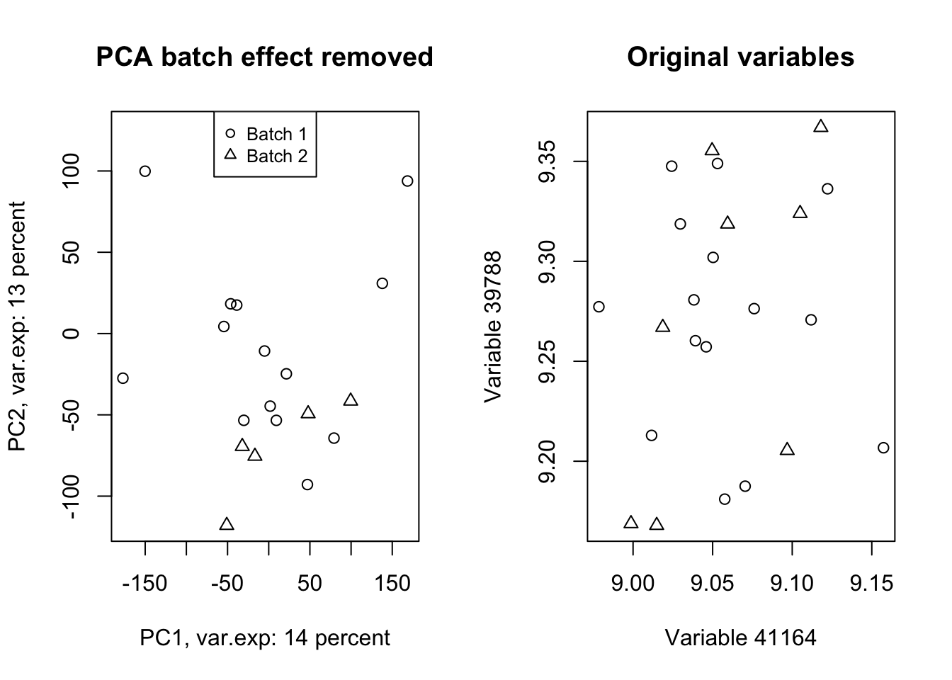
Figure 4.13: PCA of the data showing the removal of batch effect in our data
Isn’t this beautiful!? What we did in this plot (Figure 4.13 ) was rebuilding (called reconstruction) of our data without the variance that we are not interested in and did another PCA to check where most of the variance is in the new data (the plot on the left)! We also plotted the same variables that we plotted in Figure 4.12. We clearly see that the batch effect has gone. We can use the very same method to remove/keep any variance or data pattern. We can also use the same method to decrease the size of images etc.
That was it for the application PCA. We are going to do some simple exercises in the next chapter and then jump into the mathematical details of PCA.