Chapter 2 Introduction
Biology has become data-intensive as high throughput experiments in genomics or metabolomics have produced datasets of massive volume and complexity. These datasets often contain a huge number of measurements such as genes, transcripts, metabolites, or proteins, measured on some number of samples. Despite that, the scientific questions vary a lot between different studies, but a common question to ask is “what does my data show?”. Obviously, this general question only makes sense in the context of narrower scientific questions. Examples could be: Does my data show any difference between the study groups? Do we have any experimental problems (e.g. batch effect)? Do we have any outliers (e.g. samples that are particularly different from the rest of the cohort)? Do any of the measurements influence the pattern of the data more than others (pattern of the data is generally defined as what data shows! E.g. differences between groups of interest)? Throughout the rest of this chapter, we refer to samples as observations (e.g patients) and measurements as variables (e.g. genes).
If we want to summarize the abovementioned questions, we can carefully say that the interest is in variance or simply how the observations are spread. Let’s take one of the variables and see how the data is spread based on this variable:
# Select variable
variableIndex<-1

# plot the data for variable 1
plot(data[,variableIndex],xlab = "Sample index",ylab = paste("Variable",variableIndex),
     ylim = c(min(data[,variableIndex])-0.1,max(data[,variableIndex])+0.1),xaxt='n')
axis(side = 1, at = 1:nrow(data), labels = 1:nrow(data))

# fig position of labels
pos_plot<-(as.numeric(data[,variableIndex]>mean(data[,variableIndex]))*2)+1
# Draw sample index
text(1:nrow(data), data[,variableIndex],  1:nrow(data),
     cex=0.65,col="red",pos=pos_plot)

# draw the mean line
abline(h=mean(data[,variableIndex],),col="red")

# for each observation draw a line from that point to the mean
for(i in 1:nrow(data))
{
  segments(x0 = i,x1 = i,y0 = data[i,variableIndex],y1 = mean(data[,variableIndex]),lty="dashed")
}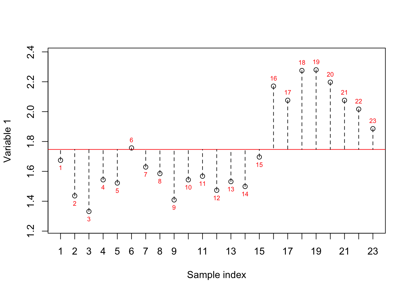
Figure 2.1: Here, we select one variable (a gene) and show how the data is spread around the mean. The red numbers show the index of each sample. The red line shows the mean and the dashed lines show the distance between each observation and mean
In Figure 2.1, we have plotted the sample number (just a simple index) on the x-axis and the expression of variable 1 on the y-axis. The red line shows the mean (average) of the variable one and the dashed lines show the distance between each observation (sample) to the mean. The variance is simply the average of squared of these distances to the mean. However, we are still not sure whether the variance we see is of any interest to us. Let’s reorder the samples based on the expression.
# Select variable
variableIndex<-18924

# plot the data for variable 1
# create x axis
x_axis<-factor(order(data[,variableIndex]),levels = order(data[,variableIndex]))
plot.default(x=x_axis,
     y=(sort(data[,variableIndex])),xlab = "Sample index",ylab = paste("Variable",variableIndex),
     ylim = c(min(data[,variableIndex])-0.1,max(data[,variableIndex])+0.1),xaxt='n',col=factor(metadata$Covariate)[order(data[,variableIndex])])
# add x axis
axis(side = 1, at = 1:nrow(data), labels = x_axis)
legend("topleft", legend=c(unique(levels(factor(metadata$Covariate)))),
       col=unique(as.numeric(factor(metadata$Covariate))), cex=0.8, pch = 1)
# fig position of labels
pos_plot<-(as.numeric(sort(data[,variableIndex])>mean(data[,variableIndex]))*2)+1
# Draw sample index
text(1:nrow(data), sort(data[,variableIndex]),  x_axis,
     cex=0.65,col=as.numeric(factor(metadata$Covariate)[order(data[,variableIndex])]),pos=pos_plot)

# draw the mean line
abline(h=mean(data[,variableIndex],),col="red")

# for each observation draw a line from that point to the mean
for(i in 1:nrow(data))
{
  segments(x0 = i,x1 = i,y0 = sort(data[,variableIndex])[i],y1 = mean(data[,variableIndex]),lty="dashed",col=
             factor(metadata$Covariate)[order(data[,variableIndex])][i])
}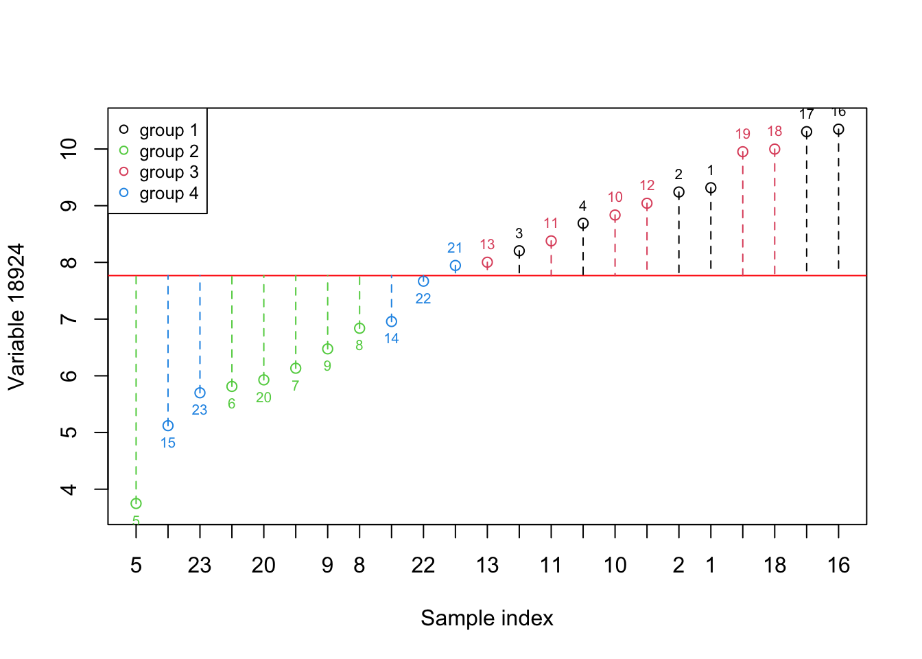
Figure 2.2: Here, we select one variable (a gene) and show how the data is spread around the mean. The red numbers show the index of each sample. The red line shows the mean and the dashed lines show the distance between each observation and mean. Please note that the samples are reordered based on the expression. the color of points show the grouping of samples
Figure 2.1 shows the same variable as Figure 2.2 but we have to reorder the observations so that the ones with lower expression come first. We have also added color so that we can see where there is a difference between the groups in this experiment. What is clear now is that the variance in this variable alone does not provide us with much useful information about all the groups. However, the second group appears to have lower expression compared to the rest of the groups. In addition, The first and the third show higher expression compared to the rest.
That’s great Let’s pick another variable and plot the same thing:
# Select variable
variableIndex<-20355

# plot the data for variable 2
# create x axis
x_axis<-factor(order(data[,variableIndex]),levels = order(data[,variableIndex]))
plot.default(x=x_axis,
     y=(sort(data[,variableIndex])),xlab = "Sample index",ylab = paste("Variable",variableIndex),
     ylim = c(min(data[,variableIndex])-0.1,max(data[,variableIndex])+0.1),xaxt='n',col=factor(metadata$Covariate)[order(data[,variableIndex])])
# add x axis
axis(side = 1, at = 1:nrow(data), labels = x_axis)
legend("topleft", legend=c(unique(levels(factor(metadata$Covariate)))),
       col=unique(as.numeric(factor(metadata$Covariate))), cex=0.8, pch = 1)
# fig position of labels
pos_plot<-(as.numeric(sort(data[,variableIndex])>mean(data[,variableIndex]))*2)+1
# Draw sample index
text(1:nrow(data), sort(data[,variableIndex]),  x_axis,
     cex=0.65,col=as.numeric(factor(metadata$Covariate)[order(data[,variableIndex])]),pos=pos_plot)

# draw the mean line
abline(h=mean(data[,variableIndex],),col="red")

# for each observation draw a line from that point to the mean
for(i in 1:nrow(data))
{
  segments(x0 = i,x1 = i,y0 = sort(data[,variableIndex])[i],y1 = mean(data[,variableIndex]),lty="dashed",col=
             factor(metadata$Covariate)[order(data[,variableIndex])][i])
}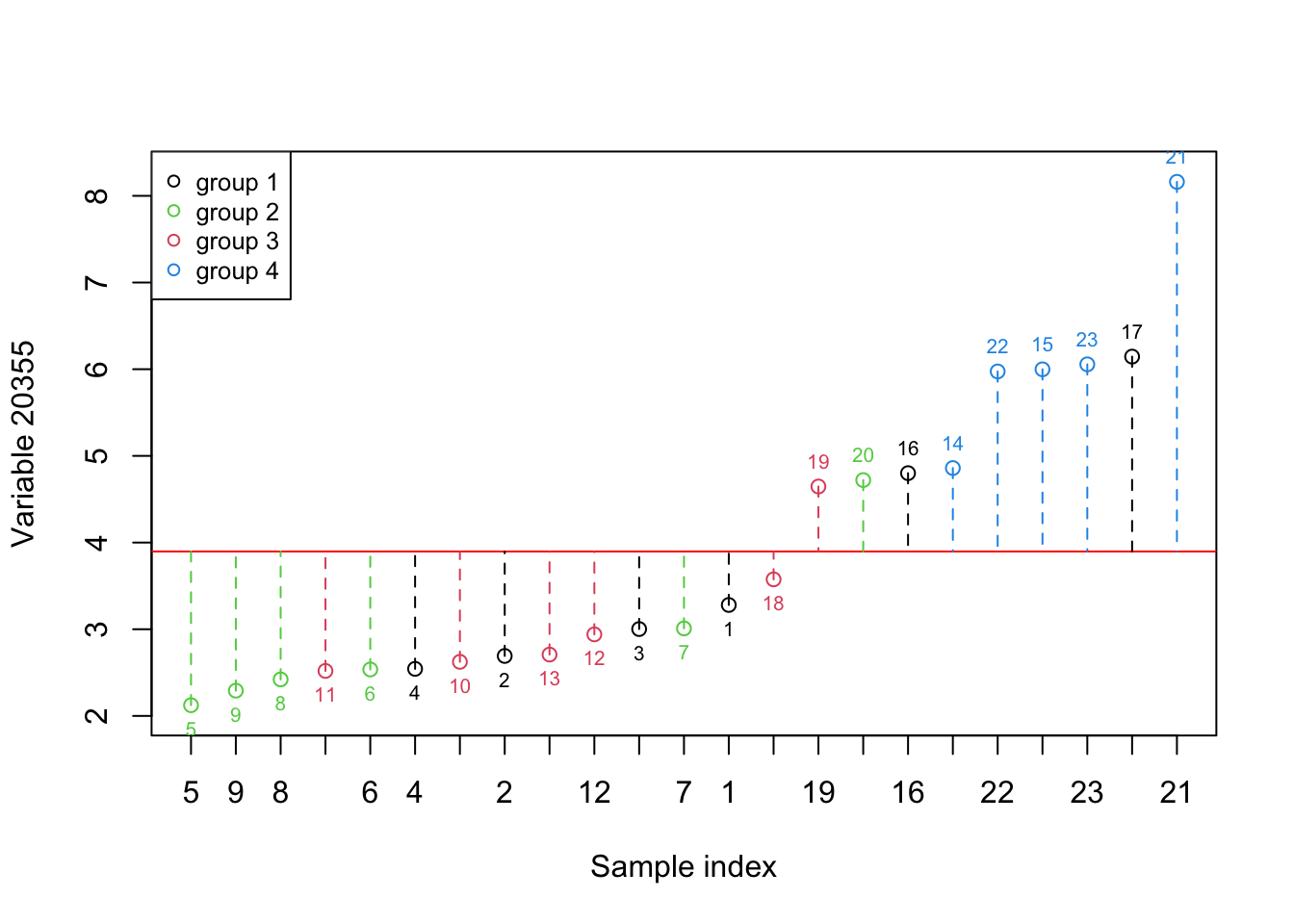
Figure 2.3: Here, we select one variable (a gene) and show how the data is spread around the mean. The red numbers show the index of each sample. The red line shows the mean and the dashed lines show the distance between each observation and mean. Please note that the samples are reordered based on the expression. the color of points show the grouping of samples
As it’s evident in Figure 2.3, the variance in this variable shows us the difference between the fourth group and the rest but it does not provide much information about the rest of the groups. Let’s have a look at what information both of these variables give. We simply put both figures Figure 2.2 and Figure 2.3 together:
par(mfrow=c(2,1))
# Select variable
variableIndex<-18924

# plot the data for variable 1
# create x axis
x_axis<-factor(order(data[,variableIndex]),levels = order(data[,variableIndex]))
plot.default(x=x_axis,
     y=(sort(data[,variableIndex])),xlab = "Sample index",ylab = paste("Variable",variableIndex),
     ylim = c(min(data[,variableIndex])-0.1,max(data[,variableIndex])+0.1),xaxt='n',
     col=factor(metadata$Covariate)[order(data[,variableIndex])])
# add x axis
axis(side = 1, at = 1:nrow(data), labels = x_axis)
legend("topleft", legend=c(unique(levels(factor(metadata$Covariate)))),
       col=unique(as.numeric(factor(metadata$Covariate))), cex=0.8, pch = 1)
# fig position of labels
pos_plot<-(as.numeric(sort(data[,variableIndex])>mean(data[,variableIndex]))*2)+1
# Draw sample index
text(1:nrow(data), sort(data[,variableIndex]),  x_axis,
     cex=0.65,col=as.numeric(factor(metadata$Covariate)[order(data[,variableIndex])]),pos=pos_plot)

# draw the mean line
abline(h=mean(data[,variableIndex],),col="red")

# for each observation draw a line from that point to the mean
for(i in 1:nrow(data))
{
  segments(x0 = i,x1 = i,y0 = sort(data[,variableIndex])[i],y1 = mean(data[,variableIndex]),lty="dashed",col=
             factor(metadata$Covariate)[order(data[,variableIndex])][i])
}

# Select variable
variableIndex<-20355

# plot the data for variable 2
# create x axis
x_axis<-factor(order(data[,variableIndex]),levels = order(data[,variableIndex]))
plot.default(x=x_axis,
     y=(sort(data[,variableIndex])),xlab = "Sample index",ylab = paste("Variable",variableIndex),
     ylim = c(min(data[,variableIndex])-0.1,max(data[,variableIndex])+0.1),xaxt='n',
     col=factor(metadata$Covariate)[order(data[,variableIndex])])
# add x axis
axis(side = 1, at = 1:nrow(data), labels = x_axis)
legend("topleft", legend=c(unique(levels(factor(metadata$Covariate)))),
       col=unique(as.numeric(factor(metadata$Covariate))), cex=0.8, pch = 1)
# fig position of labels
pos_plot<-(as.numeric(sort(data[,variableIndex])>mean(data[,variableIndex]))*2)+1
# Draw sample index
text(1:nrow(data), sort(data[,variableIndex]),  x_axis,
     cex=0.65,col=as.numeric(factor(metadata$Covariate)[order(data[,variableIndex])]),pos=pos_plot)

# draw the mean line
abline(h=mean(data[,variableIndex],),col="red")

# for each observation draw a line from that point to the mean
for(i in 1:nrow(data))
{
  segments(x0 = i,x1 = i,y0 = sort(data[,variableIndex])[i],y1 = mean(data[,variableIndex]),lty="dashed",col=
             factor(metadata$Covariate)[order(data[,variableIndex])][i])
}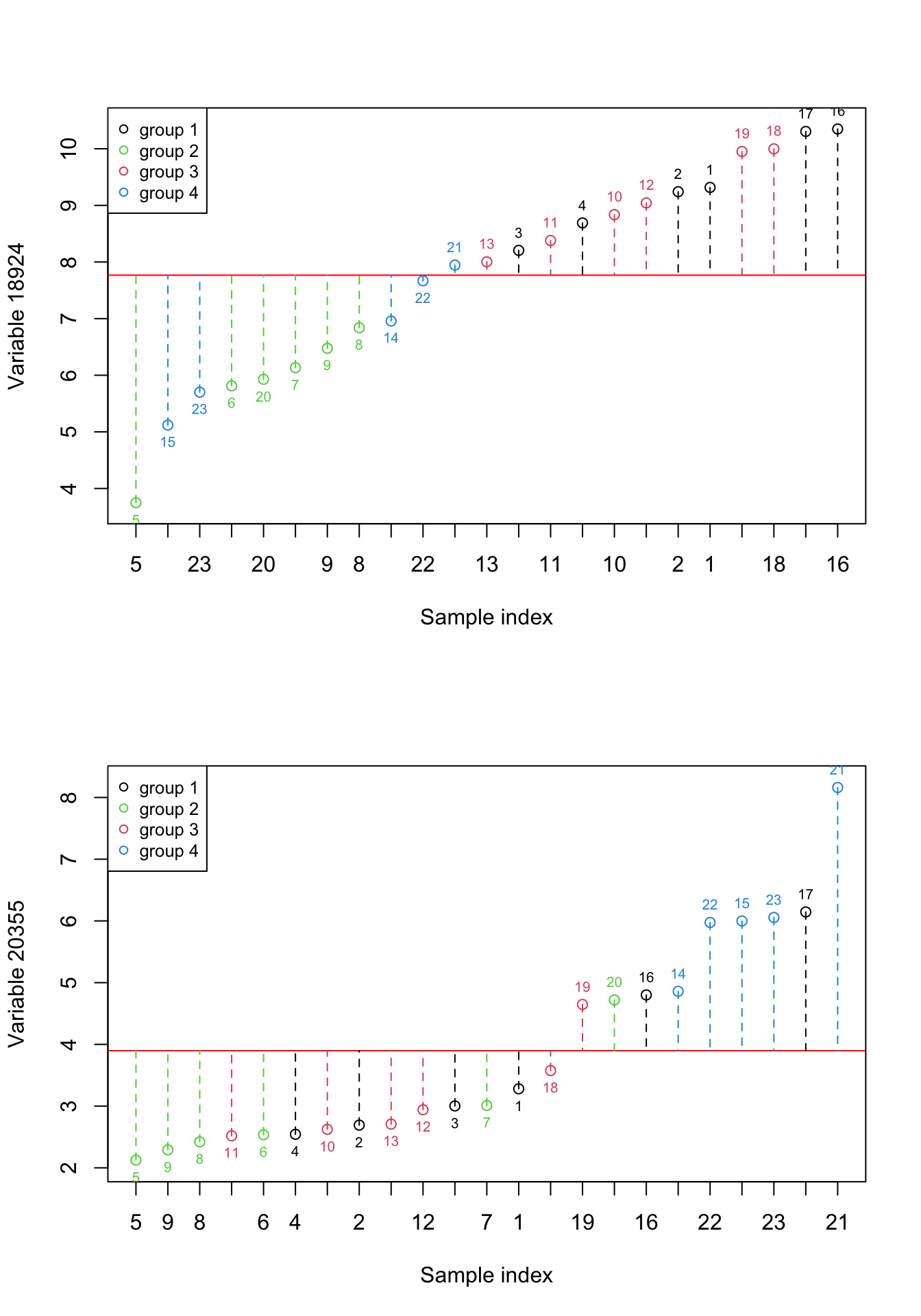
Figure 2.4: Here, we select two previous variables and show how the data is spread around the mean. The red numbers show the index of each sample. The red line shows the mean and the dashed lines show the distance between each observation and mean. Please note that the samples are reordered based on the expression. the color of points show the grouping of samples
We can see in Figure 2.4, there is obviously some information that is almost only explained by individual variables. For example, the differences between group 2 and group 4 are mostly explained by variable 20355. But there is also some small information that seems to be redundant. For example the differences between combined groups 1 and 3 vs group 4. We can have a look at variance and redundancy together by plotting the expressions of both variables against each other.
plot(data[,c(18924,20355)],col=factor(metadata$Covariate))
# define variables
var1<-18924
var2<-20355
# plot the data
plot(data[,c(var1,var2)],col=factor(metadata$Covariate),xlab = "Variable 1", ylab = "Variable 2")
# create legend
legend("topleft", legend=c(unique(levels(factor(metadata$Covariate)))),
       col=unique(as.numeric(factor(metadata$Covariate))), cex=0.8, pch = 1)
# fig position of labels
pos_plot<-(as.numeric(sort(data[,variableIndex])>mean(data[,variableIndex]))*2)+1
# Draw sample index
text((data[,var1]), (data[,var2]),  1:nrow(data),
     cex=0.65,col=as.numeric(factor(metadata$Covariate)),pos=pos_plot)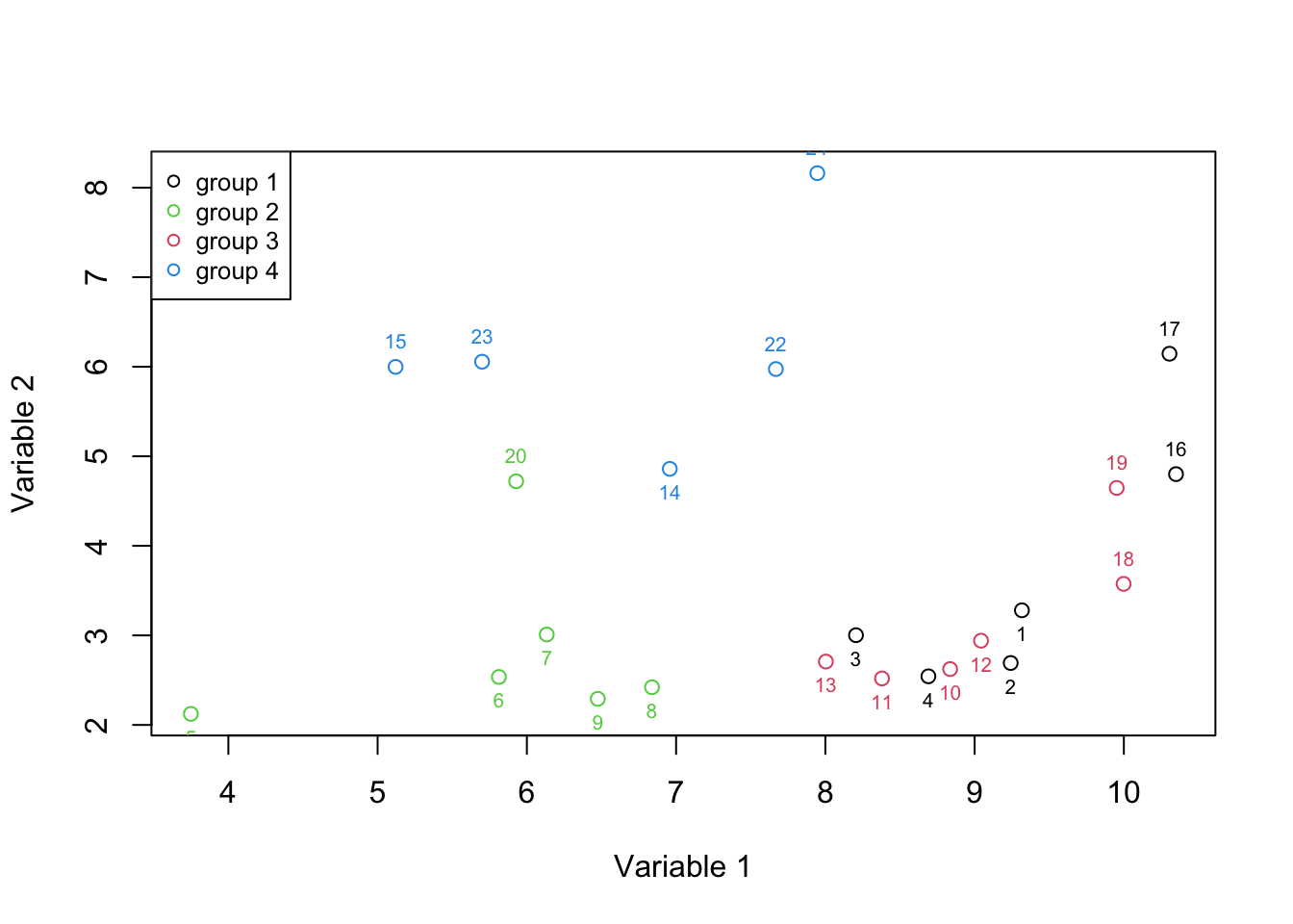
Figure 2.5: Here, we select two variables and show how the data is spread according to both of the variables.
Figure 2.5 is called a 2d scatter plot that is used to show the relationships between two variables. It’s now more evident that we can separate groups 2 and 4 more easily. This means the combination of two variables gave us more information than a single variable at the time. At this time we can more formally say that we have two axis x and y (Variable 1 and 2) which define our data. Each axis has some information. To quantify that information, let’s agree that the amount of information in each axis is measured by the variance of the observations in that axis. As said before, the variance is defined as the average squared distances from the mean. That can be easily computed using a simple R function (var):
# calculate the variance of variable 1
variance_var1<-var(data[,var1])

# calculate variance of variable 2
variance_var2<-var(data[,var2])

sprintf("variance of variable1: %f Varition of variable2: %f",variance_var1,variance_var2)
## [1] "variance of variable1: 3.282278 Varition of variable2: 2.753621"In the beginning, it might sound to use variance to quantify information as one variable can contain a huge noise level that can easily be higher than another variable that is more informative. However, in the presence of no additional information (such as groups in this example), we can at least assume (hope) that if the experiment has been done perfectly the variance of information is higher than the variance of noise. So in this case, we can say that variable 1 has more information than variable 2.
We also mentioned that any two variables can possibly contain redundant information. To quantify that, we use a method that is called covariance. Covariance measures to what extent two variables are showing the same information. To calculate the covariance, for each of the observations (samples), we calculate the difference of that observation to the mean for variable 1, we do the same thing for variable 2 and then multiply this by the resulting numbers. Once we did that for all the observations, we sum all the numbers and divide the results by the total number of observations. The sign of covariance tells whether the two variables are positively or negatively related. The magnitude of covariance can be thought of as a total variance or the amount of redundancy between two samples. The higher the absolute value the higher the redundancy (we go through this in detail in the next chapters). The covariance of zero or close to zero means we have no or little redundancy.
Let’s try to see what’s visually happening:
# define variables
var1<-18924
var2<-20355
# plot the data
plot(data[,c(var1,var2)],xlab = "Variable 1", ylab = "Variable 2")

# fig position of labels
pos_plot<-(as.numeric(sort(data[,variableIndex])>mean(data[,variableIndex]))*2)+1
# Draw sample index
text((data[,var1]), (data[,var2]),  1:nrow(data),
     cex=0.65,pos=pos_plot)

# plot mean of variable 1
abline(v=mean(data[,var1]),col="purple",lty=1)

# plot mean of variable 2
abline(h=mean(data[,var2]),col="coral",lty=1)

for(i in 1:nrow(data))
{

    segments(x0 = (data[,var1])[i],x1 = mean(data[,var1]),y0 = (data[,var2])[i],y1 =  (data[,var2])[i],lty="dashed",
             col=ifelse(data[i,var1]>mean(data[,var1]),yes = "indianred1",no = "lightblue"))


    segments(x0 = (data[,var1])[i],x1 = (data[,var1])[i],y0 = (data[,var2])[i],y1 =  mean(data[,var2]),lty="dashed",
             col=ifelse(data[i,var2]>mean(data[,var2]),yes = "indianred1",no = "lightblue"))
}

# add areas to the plot

text(4,8,"Area 1")
text(10,8,"Area 2")
text(10,2.5,"Area 3")
text(4,2.5,"Area 4")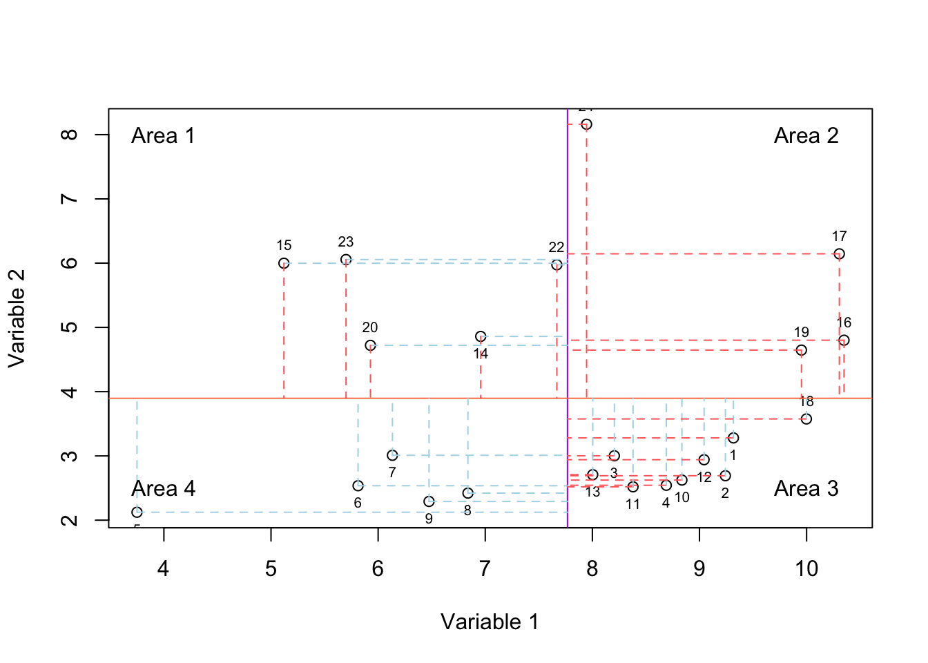
Figure 2.6: Here, we select two variables and show how the data is spread according to both of the variables. The solid purple and coral lines show mean of variable and variable 2, respectively. For each observation, we have two lines showing whether it has higher or lower value compared to mean of variable one and variable 2.
In Figure 2.6, we have plotted the mean of variable 1 using the vertical purple line and mean of variable 2 using the horizontal coral line. For each observation we have two lines, the vertical line shows the difference of that observation to the mean of variable 1 and the horizontal line shows the difference to the mean of variable 2. If the line is red, it means the difference is higher than zero and if the mean is blue, it means the difference is negative thus lower than zero.
If an observation lays in areas 1 or 3, it means that it behaves oppositely (relative to the mean: solid lines) in variables 1 and 2. This means if the expression goes up in variable 1, it goes down in variable 2 (or vice versa). However, if an observation lays in areas 2 or 4, it means its behavior is consistent in both of the variables. If most observation end up being in areas 2 and 4, we will have a positive covariance, meaning that they change consistently both in variable 1 and variable 2. If most of them are in areas 1 and 3, we will have a negative covariance, meaning that they change in opposite directions. If the observations lay in all the four areas with approximately the same magnitude (distance to the mean: length of the red and blue lines), we will have a low or no covariance.
Please note that the magnitude of the distances to the mean is also very important. For example, even if all the observations end up in areas 1 and 3 but one observation lays in area 2 with a very large distance from the means, we could still get a large positive covariance. In R the covariance is calculated using “cov” function:
# calculate the variance of variable 1
covariance_var1_2<-cov(data[,var1],data[,var2])

sprintf("Covariance of variable1 and variable 2 is: %f",covariance_var1_2)
## [1] "Covariance of variable1 and variable 2 is: 0.172791"We see that we got a low covariance which means that we have small redundancy in the two variables. This was expected just by looking at Figure 2.6. Most of our observations ended up being scattered in all four areas with very similar magnitudes.
This might be exciting as we have two variables that are showing complementary information. We did not waste our resources on measuring the things that are showing the same information. However, we have a bigger issue here! We just took a look at two of the variables out of 45101 measured ones! We specifically selected these variables to show this information. Look at this new variable:
# define number of plots in the figure
par(mfrow=c(1,3))

# define variables
var1<-18924
var2<-20355
var3<-18505
# plot the data variable 1 vs 3
plot(data[,c(var1,var3)],xlab = "Variable 1", ylab = "Variable 3",col=factor(metadata$Covariate))

# create legend
legend("topleft", legend=c(unique(levels(factor(metadata$Covariate)))),
       col=unique(as.numeric(factor(metadata$Covariate))), cex=0.8, pch = 1)

# plot the data variable 2 vs 3
plot(data[,c(var2,var3)],xlab = "Variable 2", ylab = "Variable 3",col=factor(metadata$Covariate))


# load 3d scatter plot library
library("scatterplot3d")

# plot the data
scatterplot3d(data[,c(var1,var2,var3)],xlab = "Variable 1",ylab="Variable 2",zlab = "Variable 3",
              angle = 10,color=as.numeric(factor(metadata$Covariate)))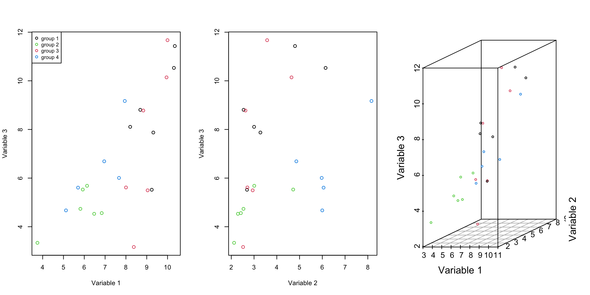
Figure 2.7: Here, we select one of the previous variables and an additional one and show how the data is spread according to both of the variables.
The covariance of this new variable with the old ones is variable one: 3.4341536 and variable 2: 1.4907196. It is also obvious from the Figure 2.7 these new variable contain redundant information.
What about others? how kind of information do they contain? which ones are redundant which ones are complimentary? If we have to do the same analysis on the entire dataset, at best, we can repeat our analysis for three variables at a time, meaning that we will end up doing that 15288975159150 times! And how about if we should use more than 3 variables at a time to inspect the data pattern?
In fact, as the dimension of data (number of variables, e.g. genes) increases, it becomes very difficult to draw conclusions from the data. We just cannot do that using simple methods. Fortunately, we have some amazing methods coming to the rescue! This is the topic of the next chapter.